Just as the work of writers relies on the universality of a dictionary, the work of designers depends on widespread, shared understanding of the meaning of images.
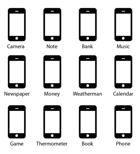
To communicate something simple—like a camera, for example—we rely on a shared image of what something that takes pictures looks like. But today, what a camera looks like is unclear.
Many of us remember that cameras once had stuff called film which, when exposed to light, captured the image in front of us. There was a shutter that opened and closed, which made a clicking sound. They used to be much larger and then, like everything, they shrank into something handheld, more portable, more affordable.
And still, with all these changes, most images we take today we take on other little digital devices: our smart phones.
So, what does a camera look like? To most (and increasingly more), a camera looks likes like a rectangle with rounded corners. Which is what a phone looks like. And a bank. And a message. Perhaps a community. Sometimes a therapist. And so many other things. Our understanding of objects has flattened.
A friend recently told me that he asked his son to answer the phone. He and his wife have a backup landline, as cell reception can be spotty in their apartment. As the phone rang, the son ran around looking for it, not knowing where it was, even though the landline was in plain view. He thought “phone” was his Mom’s orange-cased iPhone. Without knowing that the ringing was coming from that unidentifiable thing on the wall, the call was missed.
Imagine if the words sunglasses, thunder, continent, and sorrow were suddenly replaced with a single, brand-new word that meant each of those things, depending on their context. How would writers respond? How would readers know which meaning you were seeking when the new word was used? This is what is happening to designers.
*****
It’s not the first time iconography has changed due to advances in technology. But it is the first time that so many functions have converged into one physical thing.
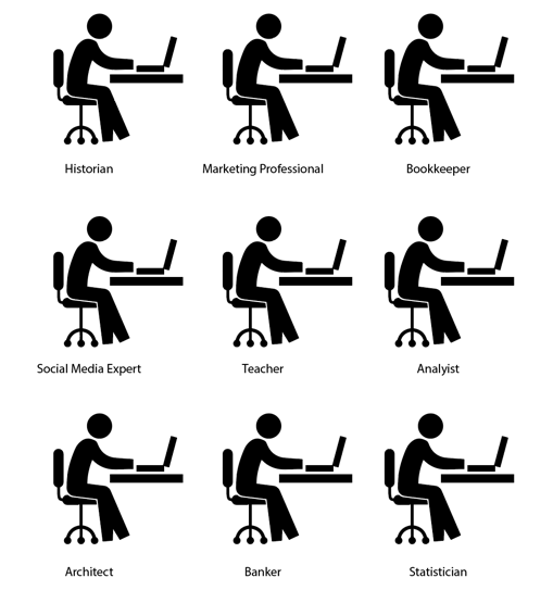
To communicate art (which is complex and hard to define as it is), it was once common to use a paint brush, a palette, a canvas, maybe even a picture frame. But now, so much art is produced digitally. The process of an artist looks the same as the process of a banker (just with different software): Someone sitting in front of a big computer screen, at a desk or a table, with a keyboard, a mouse, maybe a tablet.
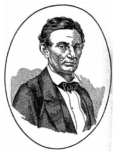
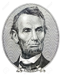
It makes me think of the board game, The Game of Life. It was created in 1860 by Milton Bradley, who was then known for a lithograph he made of a beardless Abraham Lincoln. Once Lincoln grew a beard, however, Bradley’s portrait lost its luster: Everyone began to associate Lincoln with his beard. (Talk about a change of meaning in imagery! Lincoln will now always have a beard until the end of time—a conclusive imprint in our minds of what he looked like, no matter how long he actually had one.)
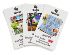
Bradley turned to board games for his next interest. The Game of Life was meant to mirror life events like getting married, going to college, raising a family, working, buying a home.
The most recent version of the game has updated careers based on what kids voted for. The game features professions like Inventor, Secret Agent, Fashion Designer. Inventor is signified by a pencil sketch of a rocket ship, and coffee (as if that’s what inventing looks like). For Secret Agent, a magnifying glass, a briefcase, a disguise. What does that have to do with the reality of being a secret agent? Don’t magnifying glasses exist on our phones, or our ‘device,’ as flight attendants refer to it?
Julian Assange wasn’t a “secret agent,” but he was a pretty serious hacker. And he did his work sitting in front of a computer — like I am right now, typing this, and like you may be while reading this.
And what about jobs that didn’t exist 10 years ago? A Market Research Data Miner. A Millennial Generational Expert. Social Media Manager. What do those look like? What images conjure up fantasies to kids wondering what they’ll be when they grow up? What would those illustrations look like in The Game of Life?
We will always rely on imagery to understand our world, to aspire towards the future, to imagine what one day we could become. It’s part of being human, it’s part of our implicit and defining need to communicate. If the path we’re on is steering us towards visual homogenization, we have to ask how this affects representation.
Consider one of the most abstract and challenging ideas of all: love. It is also perhaps the most universally understood symbol: the heart. And although its elusive origin is divorced from its common use — we use a heart to mean anything from “thinking of you” to “I’m sorry” to “that’s awesome” — the heart symbol today is flexible, contextual, malleable, ubiquitous.
Designers, of course, have a responsibility to address these changes. But ultimately, like the story of Lincoln’s portrait, what becomes meaningful and fixed in people’s minds, may be impossible to predetermine — it’s always subject to how the our audience responds.
Sue Walsh is a Creative Director at SYPartners and faculty at the School of Visual Arts. Sue is formerly the Senior Art Director at Milton Glaser Incorporated. This piece was originally published at posted by SYPartners.
