

In this post, we’ll show you how to create a person module with bio on click. As soon as you click on another person module in that same row, the text within the bio will change. At any time, you can close the bio by clicking on the person module again.
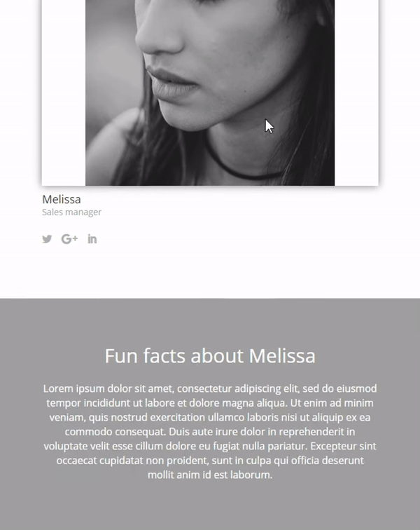
You can use this to, for example, show some additional information about your employees on your company’s website. The concept helps you do two things: interact with your visitors and save place on your website. The only time the bio will actually get shown is once a visitor shows interest and decides to click on the elements within the Person Module.
- 1 Result Person Module With Bio on Click
-
2
Person Module With Bio on Click for Desktop
- 2.1 Add The Person Standard Section With a Three-Column Row
- 2.2 Add a Person Module
- 2.3 Clone The Person Module
- 2.4 Add The Bio Standard Section with a Fullwidth Row
- 2.5 Add Two Text Modules
- 2.6 The Different CSS Classes
- 2.7 Add Display CSS Code to Section & All The Text Modules
- 2.8 Disable on Phone & Tablet
- 3 Person Module With Bio on Click for Tablet & Phone
- 4 Add The jQuery Code
- 5 Final Result
- 6 Wrapping up
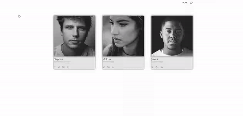
Result Person Module With Bio on Click
Before we dive into the different steps that you’re required to follow to achieve a Person Module with bio on click, let’s take a look at the final result on desktop:
and the end result on mobile and tablet:
With mobile, if one bio gets opened, the other two bios will automatically be closed. You’ll always have just one bio section open, although each bio has its own section.
Person Module With Bio on Click for Desktop
Subscribe To Our Youtube Channel
To make everything work smoothly, we’ll need to make two versions: one for desktop and one for tablets and phones. Each one of these versions will need its own jQuery code. We’ll get started with the desktop version and in the next part of the post we’ll show you how to make the version for tablets and phones.
Add The Person Standard Section With a Three-Column Row
The first thing we’ll need to do is add a section that contains the Person Modules.
Open a new page (or the page where you’d like to add the Person Module with bio) and add a new standard section. Within that section, place a row of three columns. Of course, you could use another number of columns as well, but the code that we’ll be using takes 3 Person Modules into account. If you want to create the same thing for other types of rows, you’ll have to make some modifications to the jQuery code that we’ll provide later on this post.
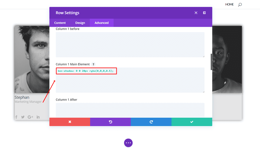
Row Settings
Open the row settings and within the content tab, add ‘#e5e5e5’ as the background color of each column.

Then, move on to the Advanced tab and insert the following box shadow to the Main Element of each one of the three rows:
Add a Person Module
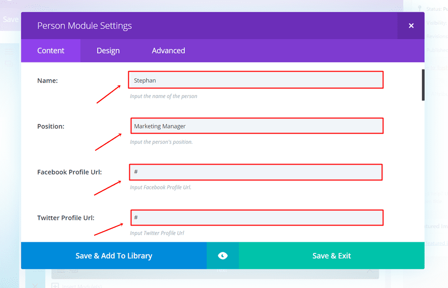
The next thing you’ll need to do is add a Person Module to the first column of the row.
Content Tab
Within the Content tab of that module, type down the info and social media links and upload the image.
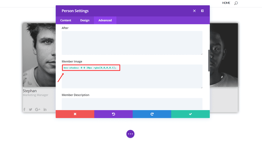
Advanced Tab
We’re not going to make any modifications to the Design tab of this module (feel free to make any changes to the appearance afterwards). Instead, we’re going to the Advanced tab right away where we’ll add the same box shadow we added to the row columns, to the member image.
Clone The Person Module
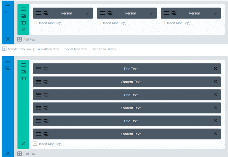
The next thing you’ll need to do is clone the Person Module twice and place it in the two other columns. We’ll need to come back to this section to add the different CSS classes. But before we do that, we’re going to add the bio section first.
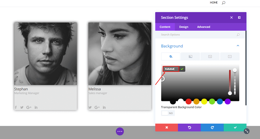
Add The Bio Standard Section with a Fullwidth Row
Add another standard section right below the previous section you’ve created. In this section, we’ll need to add the different text modules that are linked to the various Person Modules. Open the settings of the section and use the ‘#a0a0a0’ color as your background color.
Add Two Text Modules
Depending on how many Text Modules you want the bio of the person module to have, you can add Text Modules. In this case, we’ll be adding two Text Modules per Person Module.
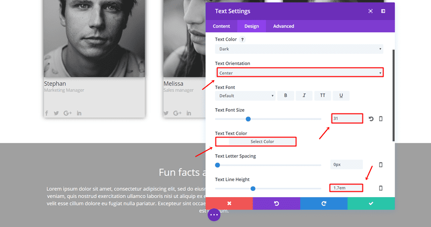
First Text Module
Type down some text in the first Text Module and go to the Design tab. Within the Design tab, make the following changes to the Text subcategory:
- Text Orientation: Center
- Text Font Size: 31
- Text Color: #FFFFFF
- Text Line Height: 1.7em
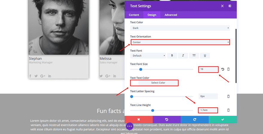
Second Text Module
Add another Text Module and make the following changes to the Text subcategory of the Design tab:
- Text Orientation: Center
- Text Font Size: 16
- Text Color: #FFFFFF
- Text Line Height: 1.7em
Clone Each Module Twice
These two Text Modules are going to be the same for each one of the bios. That’s why you should clone each one of the Text Modules twice. This is how the final structure should look like on the back-end of the page:
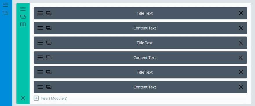
The Different CSS Classes
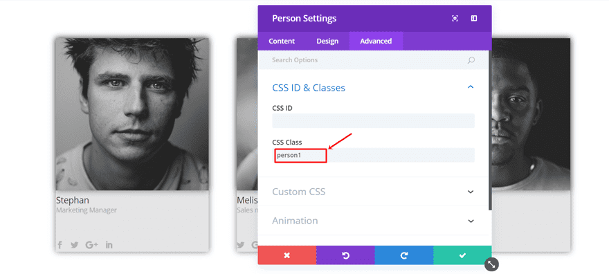
Assign CSS Classes to The Person Modules
Go to the Advanced tab of each one of the Person Modules and assign the following CSS classes:
- First Person Module: person1
- Second Person Module: person2
- Third Person Module: person3
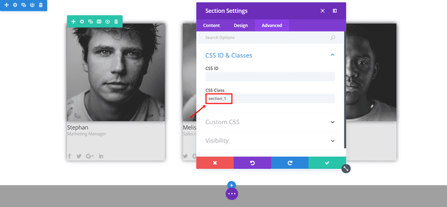
Assign CSS Class to The Section
Open the settings of the section where your bios are placed. Go to the Advanced tab and write down “section_1” into the CSS class.
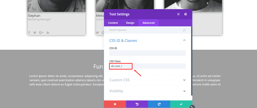
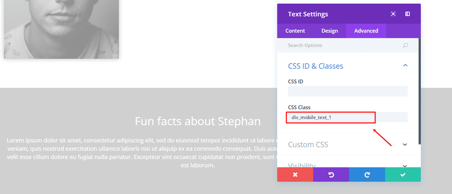
Assign CSS Classes to The Text Modules
Now, add the CSS Classes to Text Modules you’ve created in the following way:
- Linked to the first Person Module: div_text_1
- Linked to the second Person Module: div_text_2
- Linked to the third Person Module: div_text_3
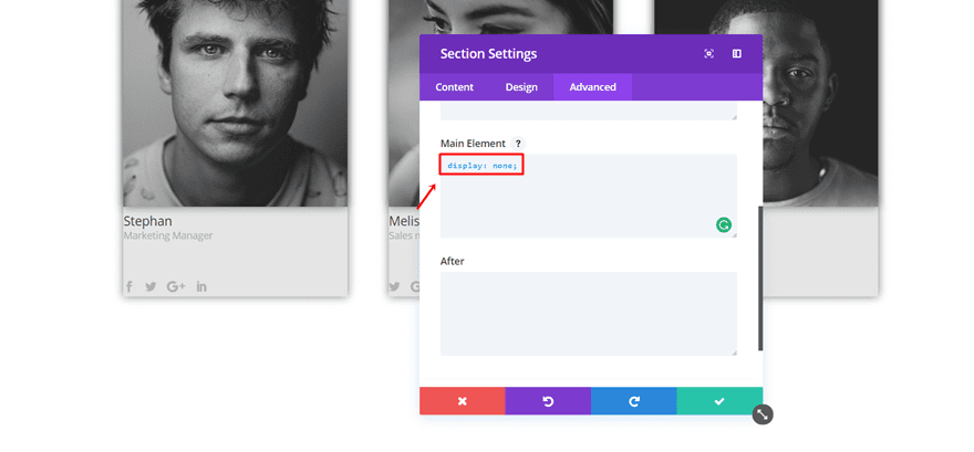
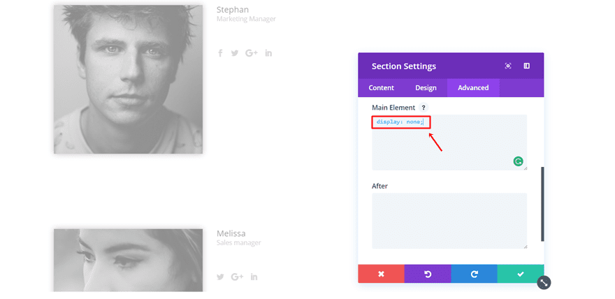
Add Display CSS Code to Section & All The Text Modules
The next step you’ll need to do is go to to the Advanced tab of the section and all the Text Modules. Then, add the following line of CSS code to the Main Element of the section:
display: none;
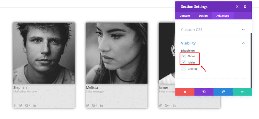
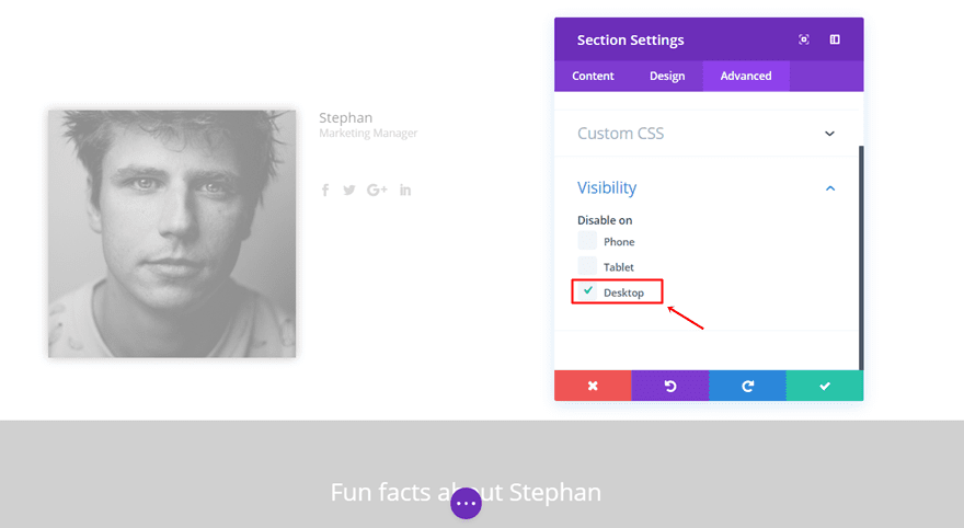
Disable on Phone & Tablet
Now, disable both sections you’ve created for mobile and tablet.
Person Module With Bio on Click for Tablet & Phone
Now that we’ve shown you how to create the person module with bio on click for desktop, we’ll show you how to make it for tablet and phone as well. We’ve already disabled the previous sections for phone and tablet. This is what the layout of the desktop looks like on the backend:
And this is the structure we need for the tablet & phone version.
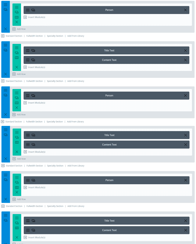
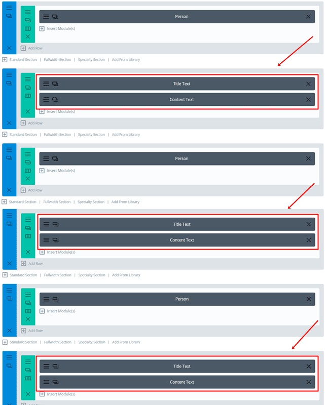
Add Six New Sections
So, go ahead and add six new sections to the page. Then, clone the person modules and put each one in a section individually. Make sure you leave a section in between, that’s where the bio will eventually come.
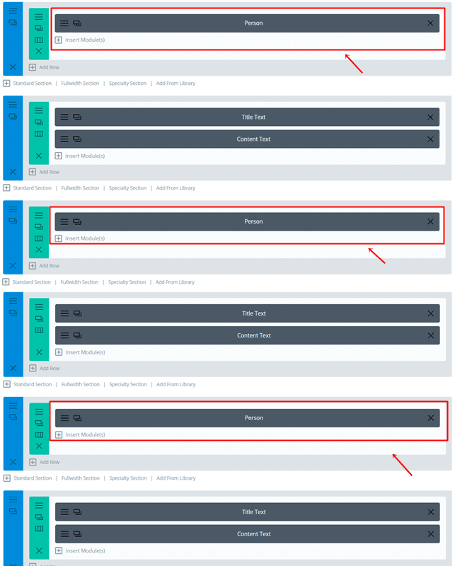
Next, add clone the text modules and place them in the section below each section that contains a Person Module. The bio will, by default, be shown below the Person Module on mobile and tablet.
 .
.
The Different CSS Classes & IDs
Once you’ve put all the sections and modules into place, it’s time to start adding the CSS classes.
Assign CSS Classes to The Person Modules
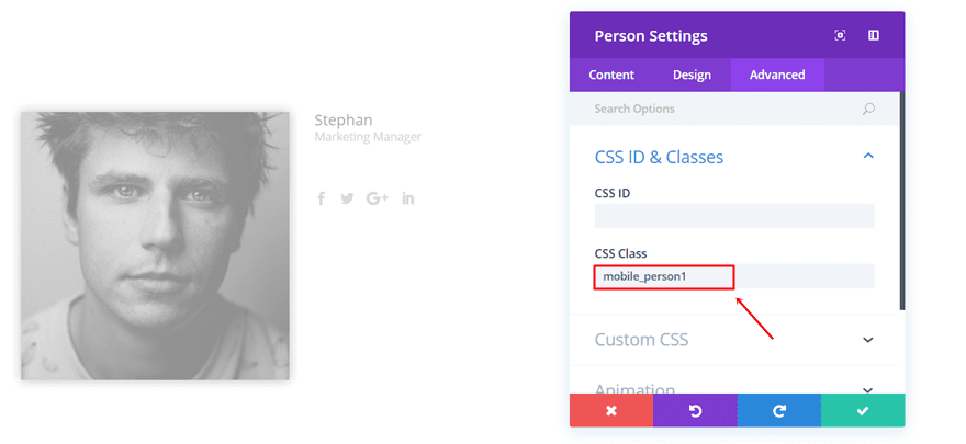
Start by opening each person module individually and changing the CSS classes in the Advanced tab to:
- First Person Module: mobile_person1
- Second Person Module: mobile_person2
- Third Person Module: mobile_person3
Assign CSS Classes to The Sections
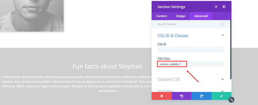
Next, open all the different bio sections and assign the following to each one of them:
- First Bio Section: section_mobile_1
- Second Bio Section: secton_mobile_2
- Third Bio Section: section_mobile_3
Assign CSS Classes to The Text Modules
The last CSS classes you’ll need to give a place are the ones linked to the Text Modules in the different bio sections. According to the bio section, assign the following CSS Classes to the Text Modules within that section:
- Linked to the first Person Module: div_mobile_text_1
- Linked to the second Person Module: div_mobile_text_2
- Linked to the third Person Module: div_mobile_text_3
Add Display CSS Code to Sections
Moving on, you’ll have to make all bio sections invisible. Go to the Advanced tab of each one of the sections and copy and paste the following line of CSS code into the Main Element:
display: none;
Make sure you remove this line of CSS code in the Main Element of each Text Module. In the Desktop version, we needed to make them invisible, but that’s not necessary for mobile and tablet.
Disable on Desktop
Now, after you’ve made all the modifications, there’s one thing left to do before adding the code: disable the three bio sections on desktop. Go ahead and open each one of the sections and go to the Advanced tab. Within the Visibility subcategory of the Advanced tab, disable the sections on desktop.
Add The jQuery Code
Now that we’ve made all the practical changes to the Divi builder, it’s time to move on to the last step; adding the jQuery code.
Add a New Code Module
The easiest way to add the code to your page is through Code Module. You’ll probably use this person module with bio on click on one page only. By using a code module, you’ll make sure the code only gets loaded when someone’s on that page. Copy and paste the two jQuery separate codes into the same code module.
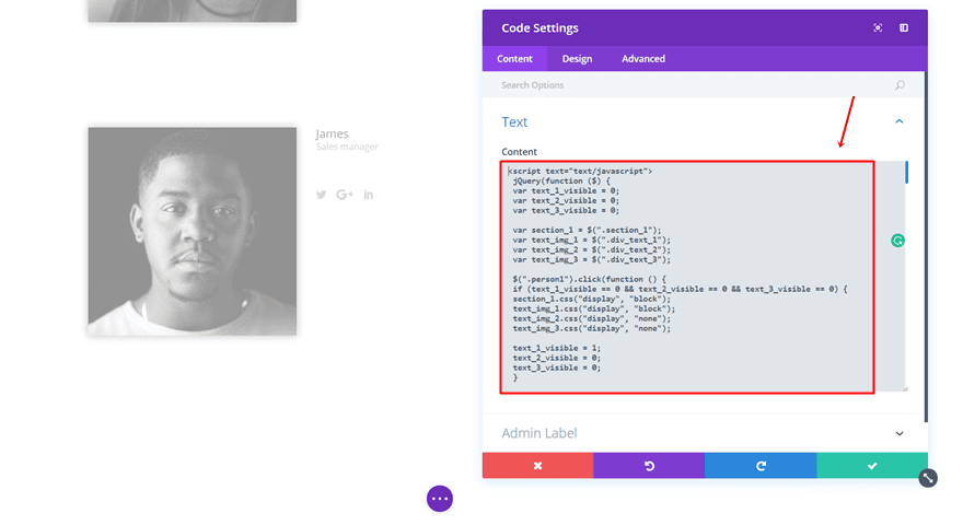
Place the Desktop jQuery Code into Your Code Module
Copy and paste the following lines of CSS code into your Code Module to make the desktop bio on click version work:
<script text="text/javascript">
jQuery(function ($) {
var text_1_visible = 0;
var text_2_visible = 0;
var text_3_visible = 0;

var section_1 = $(".section_1");
var text_img_1 = $(".div_text_1");
var text_img_2 = $(".div_text_2");
var text_img_3 = $(".div_text_3");

$(".person1").click(function () {
if (text_1_visible == 0 && text_2_visible == 0 && text_3_visible == 0) {
section_1.css("display", "block");
text_img_1.css("display", "block");
text_img_2.css("display", "none");
text_img_3.css("display", "none");

text_1_visible = 1;
text_2_visible = 0;
text_3_visible = 0;
}

else if (text_2_visible == 1 || text_3_visible == 1) {
section_1.css("display", "block");
text_img_1.css("display", "block");
text_img_2.css("display", "none");
text_img_3.css("display", "none");

text_1_visible = 1;
text_2_visible = 0;
text_3_visible = 0;
}

else {
section_1.css("display", "none");
text_img_1.css("display", "none");

text_1_visible = 0;
text_2_visible = 0;
text_3_visible = 0;
}
});

$(".person2").click(function () {
if (text_1_visible == 0 && text_2_visible == 0 && text_3_visible == 0) {
section_1.css("display", "block");
text_img_2.css("display", "block");
text_img_1.css("display", "none");
text_img_3.css("display", "none");

text_1_visible = 0;
text_2_visible = 1;
text_3_visible = 0;
}

else if (text_1_visible == 1 || text_3_visible == 1) {
section_1.css("display", "block");
text_img_2.css("display", "block");
text_img_1.css("display", "none");
text_img_3.css("display", "none");

text_1_visible = 0;
text_2_visible = 1;
text_3_visible = 0;
}

else {
section_1.css("display", "none");
text_img_2.css("display", "none");

text_1_visible = 0;
text_2_visible = 0;
text_3_visible = 0;
}
});

$(".person3").click(function () {
if (text_1_visible == 0 && text_2_visible == 0 && text_3_visible == 0) {
section_1.css("display", "block");
text_img_3.css("display", "block");
text_img_1.css("display", "none");
text_img_2.css("display", "none");

text_1_visible = 0;
text_2_visible = 0;
text_3_visible = 1;
}

else if (text_1_visible == 1 || text_2_visible == 1) {
section_1.css("display", "block");
text_img_3.css("display", "block");
text_img_1.css("display", "none");
text_img_2.css("display", "none");

text_1_visible = 0;
text_2_visible = 0;
text_3_visible = 1;
}

else {
section_1.css("display", "none");
text_img_3.css("display", "none");

text_1_visible = 0;
text_2_visible = 0;
text_3_visible = 0;
}
});
});
</script>
Place the Tablet & Phone jQuery Code into Your Code Module
And the following lines of code to make the version for tablet and phone work:
<script text="text/javascript">
jQuery(function ($) {
var text_1_visible = 0;
var text_2_visible = 0;
var text_3_visible = 0;

var section_1 = $(".section_mobile_1");
var section_2 = $(".section_mobile_2");
var section_3 = $(".section_mobile_3");

var text_img_1 = $(".div_mobile_text_1");
var text_img_2 = $(".div_mobile_text_2");
var text_img_3 = $(".div_mobile_text_3");

$(".mobile_person1").click(function () {
if (text_1_visible == 0 && text_2_visible == 0 && text_3_visible == 0) {
section_1.css("display", "block");
text_img_1.css("display", "block");
section_2.css("display", "none");
text_img_2.css("display", "none");
section_3.css("display", "none");
text_img_3.css("display", "none");

text_1_visible = 1;
text_2_visible = 0;
text_3_visible = 0;
}

else if (text_2_visible == 1 || text_3_visible == 1) {
section_1.css("display", "block");
text_img_1.css("display", "block");
section_2.css("display", "none");
text_img_2.css("display", "none");
section_3.css("display", "none");
text_img_3.css("display", "none");

text_1_visible = 1;
text_2_visible = 0;
text_3_visible = 0;
}

else {
section_1.css("display", "none");
text_img_1.css("display", "none");

text_1_visible = 0;
text_2_visible = 0;
text_3_visible = 0;
}
});

$(".mobile_person2").click(function () {
if (text_1_visible == 0 && text_2_visible == 0 && text_3_visible == 0) {
section_1.css("display", "none");
text_img_1.css("display", "none");
section_2.css("display", "block");
text_img_2.css("display", "block");
section_3.css("display", "none");
text_img_3.css("display", "none");

text_1_visible = 0;
text_2_visible = 1;
text_3_visible = 0;
}

else if (text_1_visible == 1 || text_3_visible == 1) {
section_1.css("display", "none");
text_img_1.css("display", "none");
section_2.css("display", "block");
text_img_2.css("display", "block");
section_3.css("display", "none");
text_img_3.css("display", "none");

text_1_visible = 0;
text_2_visible = 1;
text_3_visible = 0;
}

else {
section_2.css("display", "none");
text_img_2.css("display", "none");

text_1_visible = 0;
text_2_visible = 0;
text_3_visible = 0;
}
});

$(".mobile_person3").click(function () {
if (text_1_visible == 0 && text_2_visible == 0 && text_3_visible == 0) {
section_1.css("display", "none");
text_img_1.css("display", "none");
section_2.css("display", "none");
text_img_2.css("display", "none");
section_3.css("display", "block");
text_img_3.css("display", "block");

text_1_visible = 0;
text_2_visible = 0;
text_3_visible = 1;
}

else if (text_1_visible == 1 || text_2_visible == 1) {
section_1.css("display", "none");
text_img_1.css("display", "none");
section_2.css("display", "none");
text_img_2.css("display", "none");
section_3.css("display", "block");
text_img_3.css("display", "block");

text_1_visible = 0;
text_2_visible = 0;
text_3_visible = 1;
}

else {
section_3.css("display", "none");
text_img_3.css("display", "none");

text_1_visible = 0;
text_2_visible = 0;
text_3_visible = 0;
}
});
});
</script>
Final Result
Let’s have a last look at the result once you’ve followed all the steps throughout this post. This is how it’ll look like on desktop:
And on mobile and tablet:
Wrapping up
In this post, we’ve shown you how to create a person module with bio that hides and shows on click. By applying this method, you’ll be able to save some place on your website and only show it to your visitors once they’ve shown interest. If you have any questions or suggestions, feel free to leave a comment in the comment section below!
Be sure to subscribe to our email newsletter and YouTube channel so that you never miss a big announcement, useful tip, or Divi freebie!


Where would I add the code to make the lightbox scroll? I tried it in a few spots, but it doesn’t want to work.
You need to add a Code Module on the layout and then paste the code inside that module.
This is great, thanks for the step-by-step; my problem though is that when my page first loads, the bio section does not display the title – only when I first click on either of the other two people images or the first one does the title (in my case simply their name) show up in the bio. Any ideas?
like adding an instruction to the script to make the mouse turn into hand over
This is a great article!!! It seems that I too am having the same issue as David and Claudia, in that when the same person module is clicked on twice it all disappears.
In addition, is there a way to add some fade in and out for the description and maybe a hoover effect to the images so that people know it is a clickable area for more info?
THANK YOU!!!
And to be clear, the issue is not only that the bio goes away, but rather that even the person images do as well and the only way to bring it up again is to refresh the page.
I changed the display of section_1, section_2, section_3 on the “else” portion of the code and now the person module remains visible even after the second click, while doing away with the “bio text” in order to have more screen real estate.
else {
section_1.css(“display”, “block”);
text_img_1.css(“display”, “none”);
text_1_visible = 0;
text_2_visible = 0;
text_3_visible = 0;
}
Hi Donjete, Thanks for the great post. I’m incorporating it into a new client’s site and it’s working great.
One question, in addition to the bios I want to use the same method to display a blog section. As in, users click on an image and the blog section appears the same way the bios do. I have tried modifying your code (not a coder) and was wondering if you can point out the error I’ve made.
jQuery(function ($) {
var blog_1_visible = 0;
var section_2 = $(“.section_2”);
var blog_img_1 = $(“.div_blog_1”);
$(“.blog1”).click(function () {
if (blog_1_visible == 0) {
section_2.css(“display”, “block”);
blog_img_1.css(“display”, “block”);
blog_1_visible = 1;
}
else {
section_2.css(“display”, “none”);
blog_img_1.css(“display”, “none”);
text_1_visible = 0;
}
});
});
Many thanks for the post and any reply!
So nice! It’s just what I need!
But I can’t make it work =(
And the same as David, when I click on the same bio twice, all of the bio modules disappear.
Hi Claudia, just told David that’s the purpose. If someone clicks on a bio once, the bio assigned to that person will show up (even if another bio is still open, it’ll get replaced). However, if someone clicks twice on the same bio, the bio should close (in case they’re not interested anymore and want to save some place on their screen). Hope that makes sense!
Thanks Donjete!! Makes sense!
Now when I click once nothing happens =(
i would add the text-center; align 🙂 the text looks much more clean in middle
Nice effect – works with images too. But when I click on the same bio twice, all of the bio modules disappear. Have I missed something, or is there a bug?
Plus, make sure the ‘section_1’ class is only assigned to the section containing the bio modules, don’t assign it to the section with the person modules.
Hi David, that’s actually the purpose; if you click on a bio once, the bio assigned to that person will show up (even if another bio is still open). However, if someone clicks twice on the same bio, the bio should close (in case they’re not interested anymore).
Hi Donjete, Your post has given me some fresh ideas on a project I’m busy with, thanks!
Your technical posts are just great, keep up the fantastic work.
Really great article. I’m having a lot of trouble reading the pale cyan code in some of the images though (i.e., it’s impossible), despite my large monitor. Any way that can be put into the text of the article or darkened up some? (If you’re looking for a specific example, the box shadow was the first I noticed.) Thanks!
While code seems OK, your design is not. Hate the lack of left padding of “subtitles” when 3 cards are shown in one row. Right now text is touching left border. It’s ok on mobile where there is no visible frame but you definitely should address this issue on desktop.
I fixed it by adding:
.et_pb_team_member_description {
padding: 0px 0px 0px 10px;
}
to the page’s CSS. Quick n’ easy.
Aha! as simple js code. Thanks for sharing
so useful thank you…