The Weekly Planet: What Extremely Muscular Horses Teach Us About Climate Change
You can’t understand the history of American energy use without them. A new visual history puts them in context.
Every Tuesday morning, our lead climate reporter brings you the big ideas, expert analysis, and vital guidance that will help you flourish on a changing planet. Sign up to get The Weekly Planet, our guide to living through climate change, in your inbox.
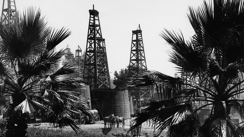
The first thing you should know about the history of energy in the United States is that, about 150 years ago, the horses got absolutely ripped.
“In the mid-19th century, you have a massive expansion of the horse body. They become 50 percent more powerful,” Robert Suits, a historian at the University of Chicago, told me.
This matters to the history of energy because, back then, horses were a primary form of transportation. (As Jason Torchinsky has written, horses were the world’s first semiautonomous vehicle.) It matters because of how the change happened at all—a massive program of selective breeding that was not possible, Suits said, until railroads existed to ferry promising horses over long distances.
And it matters, finally, because you must understand how yoked horses are to figure out how much energy the U.S. economy used to use. In the 1810s, the average American horse ate 25,000 to 30,000 calories a day, Suits said. By 1900, each ate 35,000 to 40,000 calories a day. That translates to far more hay and oats.
That tidbit is one of many things I learned from an astonishing new research project from Suits and his colleagues. It’s a history of the American energy system in chart form, from 1800 to 2019. It was published today:
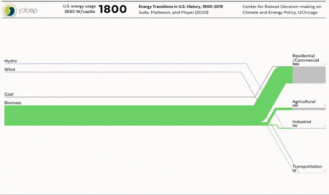
This type of chart is called a Sankey diagram, which shows the relative size of flows in and out of a system. This particular Sankey diagram shows the inputs and outputs for the U.S. energy system, measured in watts per capita. The left side of the chart shows where energy is coming from (coal, natural gas, or petroleum) and the right side shows what it’s being used for (transportation, agriculture, or home lighting and heating).
You can find a full interactive version of their chart online. Honestly, I’ve featured this chart here in the hopes that you’ll go to their website and play around with it. There is … a lot going on in it. As far as I’m aware, this is the first attempt to put so much information about U.S. energy history in one place. “You could write a book from that Sankey alone,” Apratim Sahay, an energy consultant based in Boston, told me.
So click around! Look at what’s happening in the year you were born versus what’s happening now. Look at what the energy system was like 100 years before you were born. It will help you think more keenly about climate change.
The U.S. Energy System in 2019
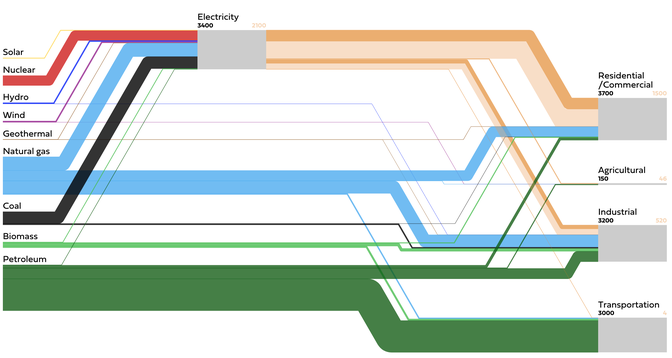
In a broader sense, I’m featuring this project because it has a lot to teach us about how the energy system got to be the way it is today—and how it might change, and be made to change, in the future.
First, you can glean the big eras in American energy use from this chart. The half century from 1800 to 1850 saw the country devour biomass, most of it in the form of firewood and animal feed. In the 1870s, biomass gave way to the first fossil fuels: coal and, to a lesser extent, petroleum. (Petroleum initially dominated as fuel for lamps, not transportation.)
By the 1910s, coal was dominant. “Coal was basically doing everything in the economy except electricity,” Suits said. It heated homes, powered railroads, and helped forge steel. But it was dirty and frustrating to move, and its price was volatile. In the 1920s, it began to fade from the economy, replaced by natural gas, electricity, and—in the transportation sector—petroleum (in the form of gasoline).
This was the age of cars and electrified Sun Belt suburbs—and it lasted 50 years, until the energy crisis of the 1970s arrived and capped energy use. Since 1973, per capita energy use hasn’t increased.
In recent years, you can see natural gas driving out coal from the electricity sector. It was getting a handle on that change, actually, that led the project’s leader to start working on it in the first place. “The changes that are happening in the electricity sector now—changes that are as large as any energy transition we’ve seen—are difficult to grasp … without animating the data,” Elisabeth Moyer, an atmospheric-chemistry professor at the University of Chicago who created the project, told me.
(This is as good a moment as any to mention that I am a visiting journalism fellow at the Energy Policy Institute at the University of Chicago this year. It is not a paid position, and I haven’t been able to visit since 2019, because of the pandemic. But it’s how I met Moyer.)
However, this narration leaves out a lot of the surprises that make the chart wonderful. Take 1800, for instance.
The U.S. Energy System in 1800
That thread of wind energy going to transportation? That’s wind filling the sails of schooners. The hydro going to industry is from rivers spinning gristmills.
And look at that chunk of biomass! That’s mostly firewood.
Another observation: Everything happens in energy history later than I expect. The first commercial coal mines operated in America in the 18th century, and the first oil well was drilled in 1859. But the amount of coal energy didn’t exceed the amount of biomass energy until 1888. And because Americans used so much firewood to heat their homes, that’s also about when the energy used in the economy exceeded the amount of energy used at home.
The same is true with electricity. Electricity started to take off only after World War II, but not until 1959 did Americans consume more electricity than coal at home.
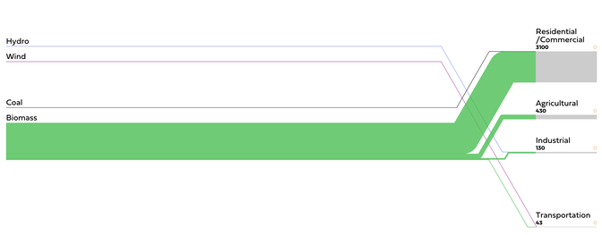
The U.S. Energy System in 1918
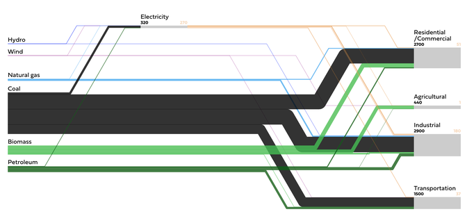
By the same token, every battle in energy seems to have happened before. Look at coal’s struggle in the 20th century—at its peak in 1918, it powered every part of the economy except agriculture. Then it declined so quickly that, by the 1960s, it seemed destined for eradication. If you had looked around then, you would’ve assumed coal had only a few short years left, Moyer and her colleagues write.
Instead, the oil crisis struck during the 1970s, and coal found a new niche. It became a fuel primarily used for generating electricity, in part because its domestic origin made it especially attractive and reliable-seeming to policy makers. Then it rallied again. It remained a core part of the energy mix until the 2010s, when it was priced out by natural gas:
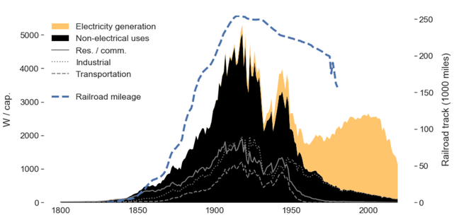
Annual U.S. Coal Use, 1800 to 2019
One more takeaway: It’s really, really hard to decrease the amount of raw fuel used in the economy. Remember, this Sankey diagram is in per capita terms. But because the country’s population is almost always growing, a decline in per capita use doesn’t translate to a decline in absolute use. In fact, since 1800, the only type of energy source to decline in absolute terms is coal, represented as black in this chart:
Total U.S. Fuel Use, 1800 to 2019

Look at that green sliver at the bottom of the chart. It’s biomass. Even in our petroleum-powered age, the U.S. uses more biomass today (about 165 gigawatts a year) than it did at any point during the 19th century. But whereas biomass became animal feed and firewood back then, today it is mostly corn used for ethanol production—and also firewood, actually.
“Historians have a habit of emphasizing firsts. When is the first viable automobile? When is the first steam engine in America?” Suits said. “But if you look at the economy, steam engines straight-up don’t matter until the 1860s or ’70s. You really start to miss that the bulk of any given transformation has to have this layer of infrastructure that enables scaling up.”
That is, indeed, Suits and Moyer’s biggest takeaway from working on this project. Energy transitions tend to move faster when they’re able to coast on infrastructure that was built for an earlier purpose. So coal was able to power so much of the economy, so quickly, because it traveled easily by railroad. Petroleum and natural gas became dominant in the 20th century after the pipeline infrastructure was built.
Likewise, Moyer said, energy transitions don’t tend to slow down because of the kinds of technologies that consumers are using. Households don’t seem to mind throwing out a coal furnace in their house in exchange for a natural-gas one, she said. Instead, it’s the lack of supply and distribution technology—such as a pipeline or the power grid—that tend to drag transitions down. And likewise, transitions can work more quickly when they’re able to use preexisting infrastructure. So once electric cars have slightly better battery life, she said, their basic obstacle to mass adoption is likely to be the lack of charging infrastructure, not the fact that many people will already own a gas-powered car.
I sent the chart to two other energy experts to get their thoughts. Emily Grubert, an engineering professor at Georgia Tech, noted that nearly all of the transitions depicted were accidental or the result of market forces. It’s possible that the transition to zero-carbon energy could be faster, she said, because it will be intentional.
Sahay, the energy consultant, noticed other details. Electrification’s growth after 1932 was inseparable from the Roosevelt administration’s program of rural electrification, he said. “The Bureau of Reclamation would build dams on river valleys, and the federal Power Marketing Administrations would sell electricity to reclaim costs,” he said. “These projects not only reduced urban-rural disparity but structurally transformed jobs in the economy from agriculture towards manufacturing and services.” They also made farms more productive. We should use a similar scheme now to electrify the rest of the economy, he said—and, in fact, that’s what Senator Bernie Sanders proposed during the presidential primary.
So what does this chart have to do with climate change? The short and glib answer is that this chart is climate change. America has emitted a quarter of the world’s total historic CO₂ pollution, 400 billion tons, more than any other country. That is what you’re looking at in this chart, in the jagged slopes of coal power and the unquenched demand for petroleum.
The second and maybe just as obvious point is that the U.S. and the entire world need to pull off an energy transition that rivals anything seen in the past two centuries. If you look at the 2019 version of the Sankey diagram, you’ll see the two largest blocks of color represent natural gas and petroleum. “The stuff we talk about wanting to do isn’t even visible on this chart,” Grubert said. Solar and wind energy are represented by lines only a few pixels wide. “We have to turn those pencil lines into boxes,” she said.
But finally, consider the horses. They were able to get so beefy in the 19th century not because the corn or oats improved, but because selective breeding was suddenly possible. It was possible because railroads existed—which, in turn, ran on coal. That means that horses today are biologically inseparable from how fossil fuels historically transformed them. So are we.
Thanks for reading. Did someone forward you this newsletter? Sign up here.