Jul18

9 Comments

Update: 11 APR 2016: I have updated this Excel file to fix some formula errors and automate the coloring of the pie charts. See more info in the More Ancestry Pie blog post!

After seeing a post online recently about creating a pie chart for of one’s ancestry, I thought it might be fun to create a spreadsheet that could calculate someone’s ancestry percentages by country and create a set of pie charts that mimics a standard ancestor chart.

I’ve created an Excel 2007 spreadsheet that does just that. It may still need some tweaking, but I like the cleaner look of my latest version better than the previous one. (I found that including names above all of the charts made it too congested and hard to read.)
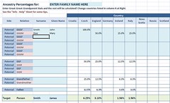
Ancestry Pie: Excel sheet capture
All one has to to in this spreadsheet is enter a their family’s names, an applicable list of ancestral countries and then the ancestry percentages for each GG-Grandparent. (An example is at left.)

After entering the GG-Grandparent’s ancestry, everyone else’s is calculated from those and a group of pie charts is created on a separate sheet.
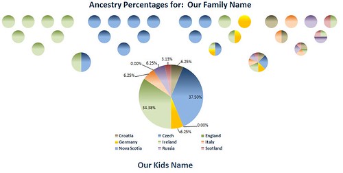
Ancestry Pie: Charts
I welcome any ideas and suggestions for improvement – I can’t promise any support, especially if it is used with versions of Excel older than 2007, but I’ll do my best to take a look.

Also included in the spreadsheet is a separate worksheet with additional notes and some slightly more detailed info on how to enter your data. (If anyone knows how to get Excel NOT to put data labels for 0.00% data without actually deleting the label, please tell me!)

It can be downloaded from my Downloads page. Be sure to look for the latest info and updates on the post  More Ancestry Pie.

Note: I updated the Excel spreadsheet on 11 Oct 2011 to with the following:

  • An additional country column for families with up to 10 different ancestral countries
  • Added a 3rd sheet that shows just the pie charts for Parents and Child, all with percentage labels
  • Cleaned up some more formatting

9 Comments

  • avatar

    Comment by CeCe Moore — November 28, 2012 @ 2:16 am

    Hi John,
    I tried downloading this Excel spreadsheet to possibly use on my blog (with due credit, of course), but I couldn’t change the country names. Would it be possible for you to tell me how I can make it calculate for Finland, Norway and England? Thanks!

  • avatar

    Comment by John — November 28, 2012 @ 11:54 am

    Hello Cece,

    The problem was that I had a column to the right of the main names sheet where the Country names could be edited. That was kind of a clunky way of doing it and was a holdover from an earlier version.

    To make it easier, I’ve updated the spreadsheet so you can just edit the column headings in the main page – makes much more sense that way.

    I also corrected a few issues with the chart pages. You can download the new version using the same links in the post.

    There is some bugginess with Excel’s handling of pie chart styles – If you notice anything country colors changing from pie to pie, Excel sometimes likes to revert to default colors.

    I’ve tried to work around the issue by using the same exact pie chart over and over and then manually changing the source data in each, but Excel keeps playing whack a mole and reverting things like font names and sizes too. If you notice anything particularly off, let me know and I’ll get out my hammer again!

    Thanks in advance for sharing it on your blog – glad it has been helpful!

    By the way, for anyone reading this: I have protected the individual sheets in the Excel spreadsheet to avoid people (any myself) making any changes that affect the charts and formulas. But, I have not password protected them, so anyone who has Excel skill and would like to try changing anything can do so.

    To Unprotect a sheet in the more recent versions of Excel, click on the “Review” tab at top then click “Unprotect Sheet”.

  • avatar

    Comment by John — August 30, 2013 @ 11:11 am

    Thanks to Sue Griffith for letting me know about some errors she found in the formulas in this chart – I hope to take a look at them soon.

    For now, check out her blog post with a tweaked version of the charts – looks great!

    http://www.genealogyjunkie.net/1/post/2013/08/ancestral-percentage-pie-charts.html

  • avatar

    Comment by Merrie Richards — August 30, 2013 @ 8:51 pm

    Is there a way to configure the spreadsheet adding in 3rd great-grandparents? Thanks

  • avatar

    Comment by John — August 30, 2013 @ 9:57 pm

    Hi Merrie,

    It is certainly possible to expand the sheet out to 3rd great-grandparents, but would take fair amount of time to reconfigure and I am sorry to say I don’t have time to do so.

    In general, for anyone who wants to try:

    You’d have to add 32 more rows at the top and bottom to cover both the maternal and paternal sides, then set formulas for the 2x-grandparents to use the 3x-grandparents’ percentages to calculate and pass down to the nearer generations.

    Also, I’d have to assume if you want to go back that far that you have more nationalities to include than the 10 there are now, so you’d have to add some number of columns for more countries. Then the real bear of the job: adding 32 more pie charts.

    Excel doesn’t make that last one easy at all since it doesn’t support painting styles in charts. That means the best way to get all the charts to use the same colors consistently is to copy and paste the same one over and over, then place them where you want them. Finally, you have to take the time to change the source data for each chart to pull from the right spots…

  • avatar

    Comment by Merrie Richards — August 30, 2013 @ 11:22 pm

    I appreciate the time and effort you spent creating the spreadsheet as well as sharing it with those of us who are also interested in our heritage.

  • avatar

    Comment by Nancy Caton — February 4, 2015 @ 7:00 am

    Download a day or so ago – thanks. Very interesting exercise. I found the far right country column wasn’t included in the totals all the time. Easy to fix, but thought you might want to know. The sum only goes to column O, but there is a column P.

    Also thought you might like to know that in the excel options there is one buried waaay down the list that alows you to display/ not display zero values in a given worksheet. I had to finally put instructions in Evernote as I only use the feature every so often.

  • avatar

    Comment by John — February 4, 2015 @ 11:34 am

    Nancy, Thanks for the heads up for the missing column in the totals!
    Now I’m hoping not too many people had to use that many columns. (I used my wife’s ancestry to test, and she needed all but one. drats.)

    I do know of the suppress zero values setting – I haven’t checked the latest version of Office, but in previous versions that only hid zeroes in cells and did not affect charts.

    This is probably my own weirdness, but I usually like to see zeroes in sheets too – that way I know that there is some sort of value or formula in the cell and I didn’t miss something – like I did with the totals and Column P. :\

    I’ve fixed the totals error already, but will wait to upload a new version for a bit. If I have time at lunch I’ll take a look at the whole sheet and the charts and comb for other things I may have missed, or might be easier done in Excel 2013. I’ll post another comment here and tweet it out as well.

    Thanks again!

  • avatar

    Comment by John — June 28, 2017 @ 1:41 pm

    Even with the capcha field enabled on my comments, getting a ton of spam through this particular post. Thanks 3rd world spammers! disabling comments here – if you have any questions about this post and spreadsheet, please use my contact form.

RSS feed for comments on this post.

Sorry, the comment form is closed at this time.