By Johny Kershaw
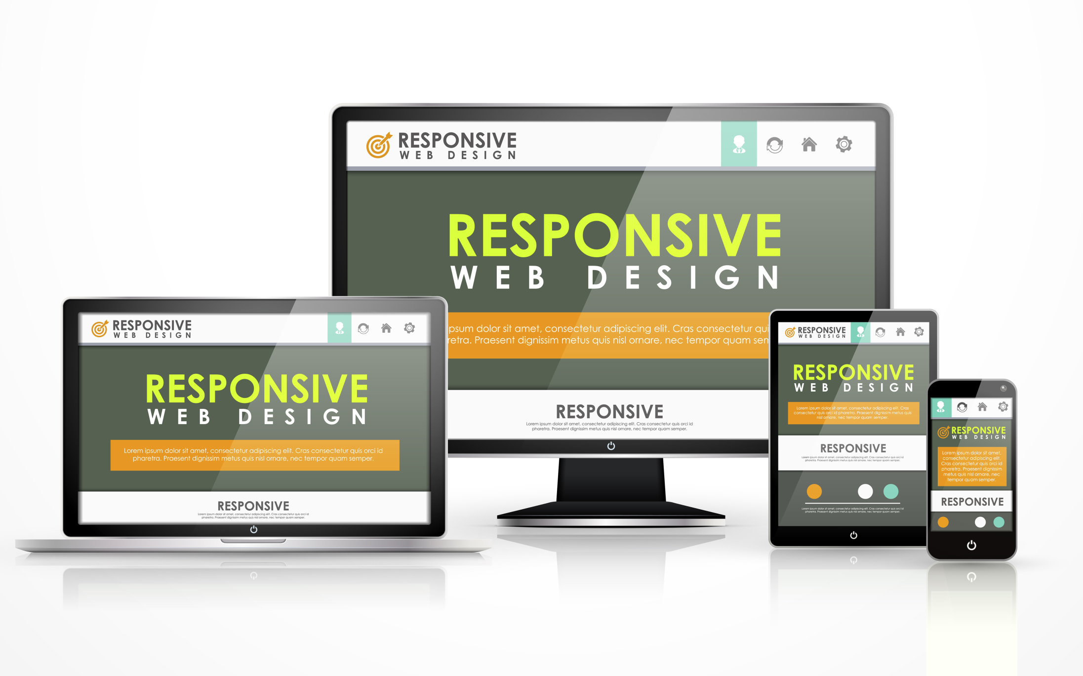
In today’s world, the rate at which the “mobile web” is growing, it is important for your website to be user friendly to the visitors who are using devices of different sizes. This is where responsive web design can save your day. Given below are 5 best practices for responsive web design.
1. Mobile users deserve the same quality of browsing experience
One of the foremost principles of responsive design is making sure that browsing experience is evenly matched for all the users. This means your site’s visual appearance should change without ever causing any content/function loss, regardless of the device the user is using. Every aspect of the website needs to be flexible, which means ensuring that the content and grid lines will reconfigure accordingly on wide range of screen sizes.
2. Design your website with a responsive mind
While designing a website, it is important to know that there are layouts ideal for responsive design and there are those which are not. There are designs which fit perfectly with assorted new sizes, all thanks to their layout and structure. This means using simple HTML codes for the core layout, using simple mechanisms for the core elements such as navigation and menu bar options. You should try to avoid complex divs and absolute positioning in your HTML code. Fancy JavaScript or using flashy designs and pop-ups are to be neglected in order to not complicate the setup. Use icons where they are necessary only.
3. Pay attention to site-load times and breakpoints
The resolution of a page can be defined according to the size of its breakpoints. There are certain sizes that you need to focus on more than the others:
- <480px – applies to old smart phones with smaller screen sizes.
- <768px – ideal for larger smart phones and smaller tablets.
- >768px – applies to devices with larger screens like desktops and laptops.
- <320px – for older, smaller, low resolution phones.
- >1024px – applies to widescreen desktops.
4. Image quality versus download speed
- Image quality is an important attractive feature of a webpage. The better the image quality, the higher is its size, and the lower will be the download speed. As important as the quality is, in order to provide best content for digital marketing, a balance between the rich visuals and the overall performance of the page needs to be maintained.
- While designing a web page, it is important to be economic while selecting the visuals, and select only out of necessity and not just because it is attractive.
- “Homepage carousels” require multiple large images as well as JavaScript to animate them. By simply removing a carousel with 4 images and shifting to a static image for the page, you can save on a lot of size for that page.
5. Pay attention to font sizes
Typography is an important aspect of responsive web design agency. When selecting a typeface, you must make sure that your selection maintains the overall display of the page, whether you scale it to larger or smaller dimension.
- Thin letterforms lack clarity when scaled down to a smaller size, and is not acceptable.
- The wider a column of text is, the more line-height is required to help users find the start of the next line.
- 16 pt. body type is the default for most screen browsers, but it is not a strict requirement.
- Make the headings at least 1.6x larger than the text they support.
- Include adequate contrast on all the copies of your site.
At the end of the day, content is the most important thing. Some content elements would never work in a mobile context. You can simply include a “not mobile” class, to specify the elements you want to see removed, when your website is viewed in a mobile context.
Ultimately if you want your responsive design website to function smoothly, you need to create it such a way that it loads data and function quickly on devices with low resolution, small processing power, and weak bandwidth access.
Johny Kershwas is an everyday learner and editor, working at Good Monster company. He is passionate about helping online businesses to achieve their goals with cost-effective SEO & Digital Marketing services. He believes that you should keep conversion rates in mind.


