
The Goal of Simplicity
Whether it’s design or instructions, we want things simple—not too simple to the point of insulting, but not too complex and thus confusing. What starts as an admirable goal – simplicity – is actually not a simple subject.
Dan Ward’s latest book, The Simplicity Cycle: A Field Guide To Making Things Better Without Making Them Worse, aims to help people make good decisions about complexity. After retiring as a Lieutenant Colonel from the US Air Force where he served for 20 years as an acquisition officer, Dan launched his own consulting firm. I recently had the opportunity to talk with Dan about the not-so-simple subject of simplicity.
Why Simplicity Matters
Define simplicity and tell us why it’s so important and a passion for you.
Simplicity is an ironically complex topic, and it means different things in different contexts. In a general sense, something is simple when it does not have a lot of interconnected parts. Of course, the definition of “a lot” changes depending on whether we’re talking about a spacecraft or a pencil sharpener. I write about both of those.
Simplicity matters because it has such a big effect on us, our technologies, and our ability to communicate. When it’s done well, simplicity makes communication clearer. It makes our technologies easier to use and more reliable. But when it’s done badly, simplicity can actually make things more confusing and harder to use, so it’s important to figure out how to do it well. Ultimately, that’s the point of the book.
Why We Overcomplicate
Why do we tend to overcomplicate things?
Making things more complicated is actually a wonderful idea sometimes, particularly in the early phase of a project. We add pieces, parts, and functions to the things we make because these additions make the thing better. This is true whether we’re writing software, making a PowerPoint presentation, or building an organization.
And because complexity is such a good idea, we tend to overcomplicate things. Our initial increases in complexity establish a pattern of behavior that, if we’re not careful, becomes counterproductive. The Simplicity Cycle diagram helps shine a light on that pattern and helps readers avoid unproductive complexity.
But sometime we make things more complicated because we want to. A client once told me, “My company is not interested in simplicity. I fear simplicity.” So that guy had inadvertently put himself on a path to overcomplicate things because he was afraid that simpler methods and simpler products would not work, would not sell. So we had to talk about that fear and figure out better ways to deal with the fear of simplicity.
The Simplicity Test
How does a leader know when something is at the right level of simplicity?
Like any skill, mastery requires time and practice with good tools. The book aims to increase a leader’s toolkit of techniques and practices. When I’m working with clients, we focus on learning to identify the different phases of a project and learning which tools to use in each phase.
At the macro level, the Simplicity Cycle provides an easy-to-use visual vocabulary to help the whole team communicate about these phases and to set a common understanding of what the project might need at any given point. It’s really a communication tool as much as an analysis technique.
Any examples of where something was made too simple?
 As the client who feared simplicity pointed out, sometimes simplicity is underwhelming and inadequate. Simplicity can feel sterile and leave us cold. And sometimes simplicity just doesn’t work.
One of the stories in my book is about an elevator indicator light that was too simple. It was a pair of round lights placed side-by-side. One light would illuminate when the elevator door opened. Because they were circles and were oriented sideways instead of top and bottom, nobody could tell whether the elevator was going up or down. It was a simple signal, but it had no message, so I had no idea whether to get on the elevator or not.
That’s an example of ambiguous simplicity. There are several ways to improve that particular light, and one way would be to add labels that say Up and Down. Adding something means it got more complicated, so that’s a way that complexity actually makes things better.
What are some of the complexity-related pitfalls?
When something is too complicated, all sorts of bad things happen. It gets heavier and demands more effort from the user. Really complex organizations have a hard time focusing and synchronizing their efforts. Really complex software is hard to test and hard to use. Really complex hardware tends to break more often.
The Complexity Trap
Would you share an example of a company who fell into a complexity trap?
Microsoft is a great example of a company that fell into a complexity trap with Windows Vista then got out of it with Windows 7. As I explain in the book, there are 15 ways to shut down a laptop running Vista. There may be a good reason for each mechanism, but there is no good reason to have all 15. And Vista was notoriously buggy and hard to use, mostly because it was more complicated than it needed to be.
Fortunately, Microsoft learned a lesson and went about their design for Windows 7 with simplicity in mind. They stripped out unnecessary complexity and ended up with a much better product. This pattern of increasing then decreasing complexity is very common in all sorts of industries, but it’s more visible in software and IT because the pace of change is so high.
The Myth of Quality
Many people think that complexity equals quality, and you point out this myth. How do you combat this thinking?
I’ve found that different people get convinced by different things. Some want to hear stories, some want to see data, some want to see general principles, and others want specific checklists that dictate behavior.
That last group is inevitably disappointed by me — I’m not real big on telling people exactly what to do, for reasons that are equal parts philosophical and practical. I think grown-ups generally need to be reminded more than they need to be informed, and a good story that illuminates a point is usually way more helpful than a prescriptive formula or some sort of three-easy-steps-to-design-bliss approach. Those tend to not work very well, or only work in very narrow situations.
I’m writing for a broad audience, so I lean towards using stories and examples. Then I trust my audience to make their own connections and figure out appropriate applications.
How did you develop your visual diagram?
I started about 21 years ago, trying to figure out how complexity affects technology. I was a junior engineering officer in the US Air Force, working on some profoundly complex military programs. I wondered how much of the complexity was really essential, how much was helpful, and how much was purely elective.
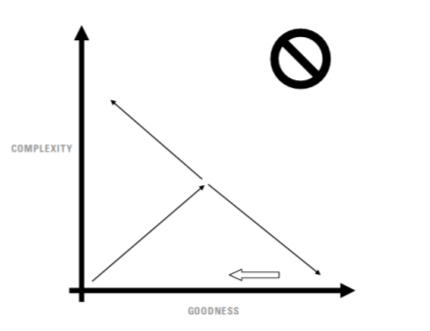
Gradually, I pieced together the relationship in this diagram and hashed it out with some colleagues. I wrote a 4-page article exploring the topic, then published a 15-page Manifesto. Sometime later I wrote and self-published a short booklet on the topic. I created a workshop presentation, and in 2015 the book version was published by HarperBusiness. So it’s been an iterative effort, and it only took a decade to become an overnight success.
The Simplicity Cycle: A Field Guide To Making Things Better Without Making Them Worse