

Twice a month, we revisit some of our readers’ favorite posts from throughout the history of Nettuts+.
Today I'm going to take you through my entire process of getting from Photoshop to completed HTML. We're going to build out a set of 4 PSD mockups of a website that eventually will become a WordPress theme. It's a massive tutorial, so if you're going to follow through to the end, make sure you have a few hours to spare!
Demos
If you're like me, you like to see the end before beginning. You can see the final four HTML files by following these links:
Download the Files
Additionally you can download the full HTML/CSS/Image source files here.
What We're Building
As you may or may not know, I've (very slowly) writing a book on WordPress theming. What we're building is actually the HTML that I'm using in the book to build the main example themes. The final set of themes is called Creatif. You can see the 4 mockups shown in screenshots below (click to get the larger versions).


Part 1 - Building the Framework and First Page
Unlike previous Site Builds this tutorial is covering a decent sized template. So we're going to take this in stages. First we'll do the framework, then the first page, then alternate pages, then finally an alternate colour scheme.
Step 1 - Getting Ready
So first of all we boot up our code editor of choice. I actually use Dreamweaver most of the time (and Textmate sometimes). I find it has some pretty decent code tools and a few features that I'm really used to (in particular a powerful Find+Replace and a quick <img> hook up). If you do use Dreamweaver, I recommend setting up a "Site".
In any case the first things to do are create a directory structure and get ready to build. I usually have an /images/ directory and a /scripts/ directory, and then plonk all my CSS and HTML in the root.


Step 2 - Quick Early Layout
The first thing we'll do is a quick overall layout in HTML with some barebones CSS just to make sure we've got a solid foundation. We can also check it in the major browsers (IE7, IE6, Firefox, Safari) just to make sure we're on a solid footing. There is nothing worse than coming back all the way to the beginning to fix browser compatibility issues. It's much better to do it as you go.
So we're building the first mockup, we can see a few things:
- The design is centred. That immediately tells us we have to wrap it in a container and then centre that container.
- Essentially the design is a series of horizontal blocks. Sometimes the blocks have two columns, sometimes one. So we can do it as a series of <div>'s. This is good because we can then mix and match elements into different pages as you'll see later.
- We have a footer which is a different colour. This means the background needs to be that colour, in case the users browser stretches. So the footer will need to sit in a different container to the main stuff.
So here's a HTML layout:
1 |
<!DOCTYPE html PUBLIC "-//W3C//DTD XHTML 1.0 Strict//EN" "https://www.w3.org/TR/xhtml1/DTD/xhtml1-strict.dtd">
|
2 |
<html xmlns="http://www.w3.org/1999/xhtml"> |
3 |
<head>
|
4 |
<meta http-equiv="Content-Type" content="text/html; charset=UTF-8" /> |
5 |
<title>Creatif</title> |
6 |
<link href="style.css" rel="stylesheet" type="text/css" /> |
7 |
|
8 |
</head>
|
9 |
|
10 |
<body>
|
11 |
<div id="main"> |
12 |
|
13 |
<div class="container"> |
14 |
|
15 |
<div id="header"> |
16 |
|
17 |
Logo / Menu |
18 |
|
19 |
</div>
|
20 |
|
21 |
<div id="block_feature"> |
22 |
|
23 |
Featured Content |
24 |
|
25 |
</div>
|
26 |
|
27 |
<div id="block_content"> |
28 |
|
29 |
Content |
30 |
|
31 |
</div>
|
32 |
|
33 |
</div>
|
34 |
|
35 |
</div>
|
36 |
|
37 |
<div id="footer"> |
38 |
|
39 |
<div class="container"> |
40 |
|
41 |
Footer Stuff Goes in Here |
42 |
|
43 |
</div>
|
44 |
|
45 |
</div>
|
46 |
</body>
|
47 |
</html>
|
As you can see there are two segments: the #main area and the #footer area. Inside each we have a <div class="container"> element which will be fixed width and centred. Then inside the main container we just have a sequence of <div>'s. Now let's add a little CSS as follows:
1 |
body { |
2 |
margin:0px; padding:0px; |
3 |
background-color:#131211; |
4 |
}
|
5 |
|
6 |
#main { |
7 |
background-color:#c4c0be; |
8 |
}
|
9 |
#footer { |
10 |
color:white; |
11 |
}
|
12 |
.container { |
13 |
width:950px; |
14 |
margin:0 auto; |
15 |
border:1px solid red; |
16 |
}
|
So we're setting the body's background colour to the dark brown of the footer. Then the #main area has the lighter background. Finally you can see the .container elements have a width of 950px and are centred using margin: auto. I've also added a red border just so you can see where the elements are on the page.
You can see the layout here, or view the screenshot below.


Step 3 - Add Some Background Images
So our layout is looking ship shape. With the main elements positioned, it's just a matter of going through and styling it all up, couldn't be easier :-)
The first thing we need are some images. You can make these yourself if you have the layered PSD's, or just grab the download ZIP and you'll find some I made earlier!
Here's a screenshot of me saving the first image - a large background JPG. I'm using this large background image to get that radial gradient highlight, then I'll use a thin 1px slice to fill out the left and right sides so it extends off.


Similarly we'll create a background image for the footer to tile along as a border between it and the main area (you can find that image in the ZIP file, it's called background_footer.jpg). Now we'll update the CSS file to remove that red border and add our new background images, as follows:
1 |
@charset "UTF-8"; |
2 |
/* Background-Styles */
|
3 |
|
4 |
body { |
5 |
margin:0px; padding:0px; |
6 |
background-color:#131211; |
7 |
}
|
8 |
#main { |
9 |
background:#c4c0be url(images/background_light_slice.jpg) repeat-x; |
10 |
}
|
11 |
#main .container { |
12 |
background-image:url(images/background_light.jpg); |
13 |
background-repeat:no-repeat; |
14 |
min-height:400px; |
15 |
}
|
16 |
#footer { |
17 |
background-image:url(images/background_footer.jpg); |
18 |
background-repeat:repeat-x; |
19 |
color:white; |
20 |
padding:40px; |
21 |
}
|
22 |
.container { |
23 |
width:950px; |
24 |
margin:0 auto; |
25 |
position:relative; |
26 |
}
|
Two things to note:
- There are multiple ways to set a background. In #main I've used a single selector which sets three properties - colour, image, image repeat. But you can also set each property individually as I've done in #main .container and #footer.
- Notice that because I want to apply the "background_light.jpg" image to the <div class='container'> which inside #main, but not to the one that is inside #footer, I've written #main .container. In other words, apply it only to elements with the class='container' that are inside elements with id='main'.
Step 4 - Testing in Browsers
So far so good. Don't forget to test in different browsers. Here you can see in IE7 it's looking fine and dandy!


Step 5 - Making a Transparent Logo
Next I've created the logo element. Because later on we'll be running an alternate colour scheme I'm going to use a transparent background PNG file. You can make these by switching off the background in Photoshop and then going to File > Save for Web and Devices and selecting PNG-24. You should be aware that PNG-24 produces pretty high file sizes. It's OK for a small image like this, but for larger ones it can be big.
(If anyone knows how to make compressed PNG files, leave a comment, because I'm pretty sure there is a way to do it, I just don't know how!)
Anyhow you can grab the transparent logo PNG here.


Now we'll add our logo and also a menu with this HTML:
1 |
<!DOCTYPE html PUBLIC "-//W3C//DTD XHTML 1.0 Strict//EN" "http://www.w3.org/TR/xhtml1/DTD/xhtml1-strict.dtd">
|
2 |
<html xmlns="http://www.w3.org/1999/xhtml"> |
3 |
<head>
|
4 |
<meta http-equiv="Content-Type" content="text/html; charset=UTF-8" /> |
5 |
<title>Creatif</title> |
6 |
<link href="step_2.css" rel="stylesheet" type="text/css" /> |
7 |
<link rel="shortcut icon" href="images/favicon.ico" /> |
8 |
</head>
|
9 |
|
10 |
<body>
|
11 |
<div id="main"> |
12 |
<div class="container"> |
13 |
|
14 |
<div id="header"> |
15 |
|
16 |
<ul id="menu"> |
17 |
<li><a href="">Portfolio</a></li> |
18 |
<li><a href="">Services</a></li> |
19 |
<li><a href="">About</a></li> |
20 |
<li><a href="">Testimonials</a></li> |
21 |
<li><a href="">Request a Quote</a></li> |
22 |
</ul>
|
23 |
|
24 |
<div id="logo"> |
25 |
<h1>Creatif</h1> |
26 |
<small>A Family of Rockstar Wordpress Themes</small> |
27 |
</div>
|
28 |
|
29 |
|
30 |
|
31 |
</div>
|
32 |
|
33 |
<div id="block_feature"> |
34 |
|
35 |
Featured Content |
36 |
|
37 |
</div>
|
38 |
|
39 |
<div id="block_content"> |
40 |
|
41 |
Content |
42 |
|
43 |
</div>
|
44 |
|
45 |
</div>
|
46 |
</div>
|
47 |
|
48 |
<div id="footer"> |
49 |
<div class="container"> |
50 |
|
51 |
Footer Stuff Goes in Here |
52 |
|
53 |
</div>
|
54 |
</div>
|
55 |
</body>
|
56 |
</html>
|
and this extra CSS:
1 |
#header { |
2 |
padding-top:20px; |
3 |
}
|
4 |
#logo h1, #logo small { |
5 |
margin:0px; |
6 |
display:block; |
7 |
text-indent:-9999px; |
8 |
}
|
9 |
#logo { |
10 |
background-image:url(images/logo.png); |
11 |
background-repeat:no-repeat; |
12 |
width:194px; |
13 |
height:83px; |
14 |
}
|
15 |
ul#menu { |
16 |
margin:0px; padding:0px; |
17 |
position:absolute; |
18 |
right:0px; |
19 |
}
|
20 |
ul#menu li { |
21 |
display:inline; |
22 |
}
|
Some things to note:
- Rather than just placing the logo image in the HTML, we've created a <div id="logo"> and inside that placed a <h1> with the title. Then using CSS we've made the text vanish and swapped it for the logo image. This has some SEO benefits.
- I used to just set the text to display:hidden, but a kind commenter on a previous tutorial pointed out that this is a bad practice and it's better to use text-indent. So as you can see I *do* read my comments :-)
- I've placed a very quick, unstyled menu using an unordered list. By setting the display property to inline for the <li> elements, the list changes to a horizontal set of elements ... yay!
- Finally because our <div class="container"> element has position:relative, we can now use absolute positioning inside and set right:0px for the menu and it will be aligned to the right. This is great for a WordPress theme because as the person creates new pages the menu will extend, and this way it will stay right aligned.
Step 6 - Fixing Transparency in IE6
Now the one problem with transparent PNGs is that our friend Internet Explorer 6 doesn't support them! Fortunately that's relatively easily fixed thanks to this article I found - The Easiest Way to Fix PNG for IE6. We just download a script and add this line in our CSS:
1 |
/* Fix up IE6 PNG Support */
|
2 |
img, #logo { behavior: url(scripts/iepngfix.htc); } |
Unfortunately for me though my testing copy of IE6 which because I'm on a Mac is through Darwine - doesn't recognize the fix ... So I have no idea if my hack is working :-)
So anyhow at this point I stopped paying attention to IE6 :-) I'm going to have to get me yet another way to view IE6, maybe through parallels.
In any case, here's a screenshot of what we get in IE6 when transparency is *not* working...


Step 7 - Fixing up the Menu
Now our menu is still looking pretty ugly, so let's add a few styles to finish it off, as follows:
1 |
ul#menu {
|
2 |
margin:0px; padding:0px; |
3 |
position:absolute; |
4 |
right:0px; |
5 |
} |
6 |
ul#menu li {
|
7 |
display:inline; |
8 |
margin-left:12px; |
9 |
} |
10 |
ul#menu li a {
|
11 |
text-decoration:none; |
12 |
color:#716d6a; |
13 |
font-family:Verdana, Arial, Helvetica, sans-serif; |
14 |
font-size:10px; |
15 |
font-weight:bold; |
16 |
text-transform:uppercase; |
17 |
} |
18 |
ul#menu li a.active, ul#menu li a:hover {
|
19 |
color:#211e1e; |
20 |
} |
Nothing very exciting here except that we've defined an "active" style which is the same as the :hover style (namely it's a darker shade). That means we can write <a href="" class="active"> and the link will darken. Later in WordPress we'll make it so that you can tell what page you are on at any given time.


Step 8 - Adding the Featured Portfolio Item Content
Now we have the base of our page laid out, it's time to start adding the content blocks. As I mentioned earlier we are going to make this site as a series of interchangeable content blocks. The first one is the "Featured Project" block. So let's add some HTML:
1 |
<div id="block_featured" class="block"> |
2 |
<span class="block_inside"> |
3 |
|
4 |
<div class="image_block"> |
5 |
<img src="images/sample_feature.jpg" /> |
6 |
</div>
|
7 |
<div class="text_block"> |
8 |
<h2>Eden Website Design</h2> |
9 |
<small>in <a href="">web design</a> tagged <a href="">corporate</a>, <a href="">web2</a></small> |
10 |
|
11 |
<p>And then a short description of the website would go in here. Something saying maybe what awesome skills I used on the project and how happy the client was. </p> |
12 |
<br /> |
13 |
<a href="" class="button">View Project</a> |
14 |
</div>
|
15 |
|
16 |
</span>
|
17 |
</div>
|
So that code goes below the <div id="header"></div> code from the previous steps. And unstyled it looks like this:


There are two important things to note here:
- You will see that we have a <div class="block"> followed immediately by a <span class="block_inside">. This is because the boxes we are drawing have a double border, first there is a 1px dark grey border, then inside that a 1px white border. So having two elements means we can have a border on each. I don't know why I used a <span> on the inside, and as you'll see later on we wind up changing it :-)
- Where we have the View Project button, instead of using an image, we're going to create a 'button' class and then apply it to regular text links. This makes for a very simple, reusable button look and feel.
Step 9 - Adding some Basic Styles
Now we apply some basic styling like this:
1 |
/*
|
2 |
Block-Styles
|
3 |
*/
|
4 |
|
5 |
.block { |
6 |
border:1px solid #a3a09e; |
7 |
background-color:#ffffff; |
8 |
margin-bottom:20px; |
9 |
}
|
10 |
.block_inside { |
11 |
display:block; |
12 |
border:1px solid #ffffff; |
13 |
background: #ffffff url(images/background_block_slice.jpg) repeat-x; |
14 |
padding:30px; |
15 |
overflow:auto; |
16 |
}
|
17 |
|
18 |
.image_block { |
19 |
border:1px solid #b5b5b5; |
20 |
background-color:#d2d2d2; |
21 |
padding:5px; |
22 |
float:left; |
23 |
}
|
24 |
.image_block img { |
25 |
border:1px solid #b5b5b5; |
26 |
}
|
27 |
.text_block { |
28 |
float:left; |
29 |
width:430px; |
30 |
margin-left:30px; |
31 |
}
|
So as I mentioned above we have the .block class which just sets a border and bottom margin. Then immediately inside we have the .block_inside element which has a white border, thin slice background (to give it that faint gradient), some padding and finally an overflow value.
We have overflow:auto because we are going to have two floated elements inside. I used to use a clearing <div> but someone in my previous comments pointed out that this works just as well and is a lot cleaner!
Then inside we have an .image_block class which gives our image a double border (one on the <div> and one on the <img> itself) and which is floated left with our main .text_block also floated left to form a mini columned layout.
So our layout now looks like this:


Step 10 - Adding Text Styles
Now the text styling is all over the place at the moment. It sort of looked OK in the previous screenshot because Firefox which I was using has defaulted to a Sans-Serif font. But if I'd screenshotted IE you would have seen a Serif'd typeface instead. So we should get the text sorted out now. We'll add these bits of CSS to our stylesheet:
1 |
body { |
2 |
margin:0px; padding:0px; |
3 |
background-color:#131211; |
4 |
font-family:Arial, Helvetica, sans-serif; |
5 |
color:#7f7d78; |
6 |
font-size:13px; |
7 |
line-height:19px; |
8 |
}
|
9 |
|
10 |
|
11 |
|
12 |
/*
|
13 |
Text-Styles
|
14 |
*/
|
15 |
|
16 |
h2 { |
17 |
margin:0px 0px 10px 0px; |
18 |
font-size:36px; |
19 |
font-family:Helvetica, Arial, Sans-serif; |
20 |
color:#000000; |
21 |
}
|
22 |
small { |
23 |
color:#595856; |
24 |
font-weight:bold; |
25 |
font-size:11px; |
26 |
display:block; |
27 |
margin-bottom:15px; |
28 |
}
|
29 |
a { |
30 |
color:#007de2; |
31 |
text-decoration:none; |
32 |
}
|
33 |
a:hover { text-decoration:underline; } |
34 |
p { margin: 0px 0px 15px 0px; } |
35 |
|
36 |
a.button { |
37 |
background:#32312f url(images/button_bg.jpg) repeat-x; |
38 |
padding:5px 10px 5px 10px; |
39 |
color: #ffffff; |
40 |
text-decoration: none; |
41 |
border:1px solid #32312f; |
42 |
text-transform:uppercase; |
43 |
font-size:9px; |
44 |
line-height:25px; |
45 |
}
|
46 |
a.button:hover { |
47 |
background:#007de2 url(images/button_bg_o.jpg) repeat-x; |
48 |
border-color:#007de2; |
49 |
}
|
So:
- First I've updated the body tag to have a default font, colour, size and line-height.
- Then we've created a <h2> style which fixes the margins and sets the font to Helvetica
- We've also created a <small> style for subheadings (like what category a post is in etc)
- We've created a link style and link:hover style
- We've reset the <p> styling so that the margins are fixed from the stupid defaults
- Finally we've created that button class. Note that I've defined it as "a.button", or in other words all <a> tags with the class = "button". Why didn't I just make it ".button" ? Well later on there is a good chance that I will make a second button class for <input>'s and it will be slightly different. So this way they won't accidentally interact.
- In the button class you will see we've set some padding, a border, a background image, a hover style and a line-height attribute ... wait a line-height attribute? Yes unfortunately this is a fix for IE which otherwise cuts off the button.
Withour extra styling, the page is starting to take shape!


Step 11 - Adding the Ribbon
One of the neat things about this design is the little blue ribbon strips in the right corner. Thanks to a mix of CSS, transparent PNG files and absolute positioning, these are really easy to add. So first we need to make the image. Once again we create an image with a transparent background and save it as PNG-24, here's the image:
Next we need to place the image in our HTML, we can do it like this:
1 |
<div class="block"> |
2 |
<img src="images/ribbon_featured.png" class="ribbon"/> |
3 |
<span class="block_inside"> |
4 |
|
5 |
<div class="image_block"> |
6 |
<img src="images/sample_feature.jpg" /> |
7 |
</div>
|
8 |
<div class="text_block"> |
9 |
<h2>Eden Website Design</h2> |
10 |
<small>in <a href="">web design</a> tagged <a href="">corporate</a>, <a href="">web2</a></small> |
11 |
|
12 |
<p>And then a short description of the website would go in here. Something saying maybe what awesome skills I used on the project and how happy the client was. </p> |
13 |
<br /> |
14 |
<a href="" class="button">View Project</a> |
15 |
</div>
|
16 |
|
17 |
</span>
|
18 |
</div>
|
So you can see the <img> tag there on the second line. Note I've given it a class="ribbon" and put it inside the .block element, but outside the .block_inside element. That's because if we do it inside .block_inside it messes up the overflow:auto property we set earlier. Anyhow right now this will just mess up our layout, so let's add some styling:
1 |
.block { |
2 |
border:1px solid #a3a09e; |
3 |
background-color:#ffffff; |
4 |
margin-bottom:20px; |
5 |
position:relative; |
6 |
}
|
7 |
.ribbon { |
8 |
position:absolute; |
9 |
top:-3px; |
10 |
right:-3px; |
11 |
}
|
You can see that we've:
- Added a position:relative attribute to the .block element. This is so that we can use absolute positioning inside and have it relative to the .block element (and not the whole page)
- Then we've set the image to appear 3px past the right edge and 3px past the top edge.
Easy! Back in the day, we would have had to use some super complicated <table> layout to achieve that same effect. Here's how it's looking now:


Step 12 - Creating the Second Block
With the ribbon added, our first block element is complete! Now it's time to start on the next <div> block. This one will have that text about the theme and the recent projects list. So first we add some HTML:
1 |
<div id="block_portfolio"> |
2 |
|
3 |
<div id="portfolio_items"> |
4 |
|
5 |
<div class="mini_portfolio_item"> |
6 |
<div class="block_inside"> |
7 |
<img src="images/sample_mini_portfolio.jpg" class="thumbnail" alt="PSDTUTS" /> |
8 |
<h3>PSDTUTS Theme Design</h3> |
9 |
<p>Website design for leading photoshop tutorial site and creation and maintenance of Wordpress theme. </p> |
10 |
<a href="#" class="button">View Project</a> |
11 |
</div>
|
12 |
</div>
|
13 |
|
14 |
<div class="mini_portfolio_item"> |
15 |
<div class="block_inside"> |
16 |
<img src="images/sample_mini_portfolio.jpg" class="thumbnail" alt="PSDTUTS" /> |
17 |
<h3>PSDTUTS Theme Design</h3> |
18 |
<p>Website design for leading photoshop tutorial site and creation and maintenance of Wordpress theme. </p> |
19 |
<a href="#" class="button">View Project</a> |
20 |
</div>
|
21 |
</div>
|
22 |
|
23 |
<div class="mini_portfolio_item"> |
24 |
<div class="block_inside"> |
25 |
<img src="images/sample_mini_portfolio.jpg" class="thumbnail" alt="PSDTUTS" /> |
26 |
<h3>PSDTUTS Theme Design</h3> |
27 |
<p>Website design for leading photoshop tutorial site and creation and maintenance of Wordpress theme. </p> |
28 |
<a href="#" class="button">View Project</a> |
29 |
</div>
|
30 |
</div>
|
31 |
|
32 |
</div>
|
33 |
|
34 |
<div id="text_column"> |
35 |
<h2 id="text_title">Creatif is a WordPress portfolio theme for designers and creatives</h2> |
36 |
<p>You can use it to quickly turn WordPress into a portfolio website. Not familiar with WordPress? Fear not, the theme accompanies a book called <a href="#">How to Be a Rockstar Wordpress Designer</a> by Rockstar Resources due for release in 2008.</p> |
37 |
<p>The book teaches you to use WordPress theming to take advantage of this flexible CMS product to create dynamic sites.</p> |
38 |
<p>And as if that’s not enough, you can see a photoshop to HTML tutorial on designing the theme over at <a href="https://design.tutsplus.com">PSDTUTS</a> and <a href="https://code.tutsplus.com">NETTUTS</a>.</p> |
39 |
</div>
|
40 |
|
41 |
</div>
|
So that looks like lots of code, but it's not really. Let's go through it:
- First we've created a container <div id="block_portfolio"> to wrap up the code segment
- Next we've got a <div id="portfolio_items"> which contains three identical <div class="mini_portfolio_item">'s. We'll talk about these in a second.
- Next we have a <div id="text_column"> which is filled with some text and a <h2> heading.
- What we are going to do is float the text column and portfolio items side by side to form two columns of content.
- We're going to replace that <h2> with a background image.
- And we'll style up those mini_portfolio_item divs to look nice using a similar double border effect as we did earlier.
Here's the CSS:
1 |
/*
|
2 |
Portfolio-Home-Styles
|
3 |
*/
|
4 |
|
5 |
#block_portfolio { |
6 |
overflow:auto; |
7 |
margin-bottom:20px; |
8 |
}
|
9 |
#portfolio_items { |
10 |
width:615px; |
11 |
margin-right:25px; |
12 |
float:left; |
13 |
|
14 |
}
|
15 |
#text_column { |
16 |
float:right; |
17 |
width:310px; |
18 |
}
|
19 |
#text_column h2#text_title { |
20 |
text-indent:-9999px; |
21 |
background-image:url(images/creatif.jpg); |
22 |
background-repeat:no-repeat; |
23 |
width:310px; |
24 |
height:129px; |
25 |
}
|
26 |
|
27 |
.mini_portfolio_item { |
28 |
border:1px solid #a3a09e; |
29 |
margin-bottom:10px; |
30 |
|
31 |
}
|
32 |
.mini_portfolio_item .block_inside { |
33 |
background:none; background-color:#e2dddc; |
34 |
padding:25px 30px 15px 30px; |
35 |
}
|
36 |
.mini_portfolio_item .thumbnail { float:left; margin-right:20px; border:1px solid #979390; } |
OK again, looks like a lot, but it's not too bad. Let's go through it step by step:
- First we've again used overflow:auto on the main #block_portfolio element. That's because we again have two floated columns and if we don't do this, they'll run over the footer.
- Next we've set #portfolio_items to float to the left, have a margin to separate it from the text column and a width of 615px.
- The #text_column is set to float to the right with a width of 310px.
- Inside the text column we've again done that trickery with our <h2> tag where we use a massive text-indent to make the text disappear and then instead use a background image.
Next we have three style definitions for the mini_portfolio_item elements as follows:
- First we set a 1px dark border and a margin between them
- Next we redefine the .block_inside styles to suit these elements. Remember .block_inside was defined earlier when we did the Featured Project area. So here we are overriding the background image, changing the background colour and changing the padding.
- Finally we make the thumbnail images float left and have a border.
So all in all it's looking like this:


Step 13 - Adding a Ribbon.
Now we want to add a "Recent Projects" ribbon to the top most item. To do this we simply slot it in, in the same position in the HTML as previously, like this:
1 |
<div class="mini_portfolio_item"> |
2 |
<img src="images/ribbon_recent.png" class="ribbon" alt="Recent Projects"/> |
3 |
<div class="block_inside"> |
4 |
<img src="images/sample_mini_portfolio3.jpg" class="thumbnail" alt="AudioJungle" /> |
5 |
<h3>AudioJungle Site Design</h3> |
6 |
<p>Website design for leading photoshop tutorial site and creation and maintenance of Wordpress theme. </p> |
7 |
<a href="#" class="button">View Project</a> |
8 |
</div>
|
9 |
</div>
|
Then we add a position:relative attribute to the mini_portfolio_item element like this:
1 |
.mini_portfolio_item { |
2 |
border:1px solid #a3a09e; |
3 |
margin-bottom:10px; |
4 |
position:relative; |
5 |
}
|
But something weird happens... While the right hand side looks correct, the top is getting cut off, as you can see in the screenshot:

The reason is that the element that our mini_portfolio_item is sitting inside is cutting it off. So we check up and see that the mini_portfolio_item's are all inside a <div id="portfolio_items">. So the solution is pretty easy, we add 3px of padding to the top which is just enough space for our ribbon to show through. Here's the adjusted CSS:
1 |
#portfolio_items {
|
2 |
width:615px; |
3 |
margin-right:25px; |
4 |
float:left; |
5 |
padding-top:3px; |
6 |
} |
Step 14 - Finishing off the Portfolio Items
Finally I've swapped in a few images and titles so we can see how the page looks with 3 different items instead of the same one repeated. Then I also decided to get rid of the View Project button and just have a text link. This looked a bit cleaner and less busy. So here's the final portfolio items section (shown in Safari, don't forget to keep testing in different browsers!):


Step 15 - Adding Footer Content
Now there is just one more section to our page: the footer! Let's add some text content to it:
1 |
<div id="footer"> |
2 |
<div class="container"> |
3 |
|
4 |
<div class="footer_column long"> |
5 |
<h3>Designed by Collis Ta’eed, do with this as you please</h3> |
6 |
<p>You can read a photoshop tutorial for creating the design at <a href="https://design.tutsplus.com">PSDTUTS</a>, You can read a PS->HTML tutorial for creating the site at <a href="https://code.tutsplus.com">NETTUTS</a> and you can learn how to turn the HTML into a Wordpress theme in the upcoming book <a href="http://freelanceswitch.com/book">How to be a Rockstar Wordpress Designer</a></p> |
7 |
</div>
|
8 |
|
9 |
<div class="footer_column"> |
10 |
<h3>More Links</h3> |
11 |
<ul>
|
12 |
<li><a href="https://design.tutsplus.com">VECTORTUTS</a></li> |
13 |
<li><a href="http://activeden.net">FlashDen</a></li> |
14 |
<li><a href="http://audiojungle.net">AudioJungle</a></li> |
15 |
<li><a href="http://freelanceswitch.com">FreelanceSwitch</a></li> |
16 |
<li><a href="http://faveup.com">FaveUp</a></li> |
17 |
</ul>
|
18 |
</div>
|
19 |
|
20 |
<div class="footer_column"> |
21 |
<h3>RSS</h3> |
22 |
<ul>
|
23 |
<li><a href="">RSS Feed</a></li> |
24 |
<li><a href="">What is RSS?</a></li> |
25 |
</ul>
|
26 |
</div>
|
27 |
|
28 |
</div>
|
29 |
</div>
|
A few things to note:
- I've created three <div class="footer_column">'s to house the content of the footer, we'll float these into place in a second.
- Since the first column is a different width I've given it a second class called "long". Note that you set two classes like this: class="class1 class2", not like this: class="class1" class="class2" which is invalid markup.
- Inside the columns I've used <ul> lists and <h3> tags for the headings. It's always good to use nice semantic markup, both because it makes it more readable, and because search engines like to see those headings and lists all laid out properly.
Here's how it's looking!


Step 16 - Styling the Footer
Styling the footer is a pretty simple job, here's the code we need:
1 |
/*
|
2 |
Footer-Styles
|
3 |
*/
|
4 |
|
5 |
#footer { |
6 |
font-family:Verdana, Arial, Helvetica, sans-serif; |
7 |
font-size:10px; |
8 |
}
|
9 |
.footer_column { |
10 |
float:left; |
11 |
width:120px; |
12 |
margin-right:30px; |
13 |
}
|
14 |
#footer .long { |
15 |
width:610px; |
16 |
}
|
17 |
#footer h3 { |
18 |
color:#e2dddc; |
19 |
text-transform:uppercase; |
20 |
font-size:10px; |
21 |
}
|
22 |
.footer_column ul li, .footer_column ul { |
23 |
list-style:none; |
24 |
margin:0px; |
25 |
padding:0px; |
26 |
}
|
Going through:
- First we set the fonts for the #footer area
- Then we set all the columns to float with a default width of 120px
- We override this width for the .long column. Notice that I've set "#footer .long" instead of just ".long". The reason I did this is that "long" is the kind of generic name I might use again later on somewhere else, so it's a good idea to specify it more clearly.
- Finally the <h3> and <ul> tags get some simple styles


Step 17 - Adding a Favicon!
We're almost finished our first page. It's time to add some niceties. First a Favicon. These are those little icons that appear in your browser bar. I don't need anything fancy, just a little black square with a C for Creatif will do nicely. So first we create a square image like this:
There are lots of sites to make Favicons (Visit SixRevisions for a list of them) but I always use html-kit's for no particular reason. You just upload the image and hit Generate Favicon.ico.
Then we hook it up with this line of HTML:
1 |
<link rel="shortcut icon" href="images/favicon.ico" /> |


Step 18 - Validating!
Now it's time to check that our markup is w3c valid! So we go to the Validator put in our code and cross fingers ... and pah-bow :-( We are not valid. I don't think I've ever been valid on the first try actually, I must have some bad habits!


Looking down there are 14 errors. The number one problem is that there is no alt text on any of my images... whoops! So going back and adding them like so:
1 |
<img src="images/ribbon_featured.png" class="ribbon" alt="Featured Project"/> |
should fix up lots of the errors. So now we run it again and ... drum roll ... D'oh! Still invalid. OK this one looks a bit trickier:


Fortunately the remaining 8 errors are actually the same problem. Basically I've used an inline element (specifically a <span class="block_inside">) and then tried to put block level elements like <div>'s inside. Apparently that's not allowed ... whoops!
Luckily that's easily fixed, we just change every instance of <span class="block_inside"> to a <div class="block_inside">. And ... YAY! We pass :-)


Finished Part 1!
OK we have successfully made our basic page! Here you can see me testing it in IE7 and thankfully there are no bugs.


Part 2 - Building the Variations
With our basic framework in place we are now ready to build the extra pages and the alternate colour scheme. Happily we've lain a good foundation and will be able to make use of a lot of the code we've already written. This is why it's really important to plan ahead.
If you don't plan you can easily wind up with a lot of duplication, extra code and other folly.
Step 19 - Building the Blog Homepage
The next page we're going to build is the blog homepage. This is similar to the portfolio homepage in that it will have a featured blog post and then a series of blog posts below. Eventually these will become two related WordPress themes - one for portfolios, one for blogs.
So first we duplicate our index.html - the file we've been working on up 'til now, and call the new file blog.html.
In our blog.html we first delete the whole <div id="block_portfolio">. We're going to replace that block with a different one shortly. Then we replace the <div id="block_featured"> with a new block for featured blog posts which is just slightly different and looks like this:
1 |
<div id="block_featuredblog" class="block"> |
2 |
<img src="images/ribbon_featuredblog.png" class="ribbon" alt="Featured Project"/> |
3 |
<div class="block_inside"> |
4 |
|
5 |
<div class="image_block"> |
6 |
<img src="images/sample_blog.jpg" alt="New Blog"/> |
7 |
</div>
|
8 |
<div class="text_block"> |
9 |
<h2>New Blog Design Launched</h2> |
10 |
<small>on <a href="">april 13</a> in <a href="">web design</a> tagged <a href="">blogging</a></small> |
11 |
<p>Lorem ipsum dolor sit amet, consectetuer adipiscing elit. Nulla mi risus, tempor in, gravida quis, rutrum vitae, massa. Suspendisse congue, nibh et lacinia sodales. </p> |
12 |
<p>Risus nulla fringilla enim, sit amet adipiscing sapien risus sed velit. Sed vitae justo. In quis lorem nec justo varius sodales. Nullam eleifend accumsan mi. Nunc at velit. Maecenas velit. </p> |
13 |
<br /> |
14 |
<a href="" class="button">Read More</a> |
15 |
</div>
|
16 |
|
17 |
</div>
|
18 |
</div>
|
So really all I've done is change the id tag to be block_featuredblog, the ribbon image and the content. Essentially though it's the same layout. So let's take a look and see how it's looking:


Step 20 - Adjusting some CSS
So that pretty much works as is, we'll just make a couple of small adjustments to the CSS like this:
1 |
#block_featuredblog .text_block { padding-top:5px; width:490px;}
|
2 |
|
3 |
h2 {
|
4 |
margin:0px 0px 10px 0px; |
5 |
font-size:36px; |
6 |
font-family:Helvetica, Arial, Sans-serif; |
7 |
color:#000000; |
8 |
line-height:39px; |
9 |
letter-spacing:-1px; |
10 |
} |
Here I've adjusted the "text_block" class but only when it's in the #block_featuredblog element. It now has a tiny bit of padding at the top and is wider.
Also I've added an appropriate line-height to the heading and on a whim adjusted the text kerning by -1px. And we're finished with this element! Easy peasy!


Step 21 - Making the Main Content Area
Making this content area is the last big thing we need to do really. It will form not only the bottom of this page, but also the whole basis of the generic page (with some adjustments of course!). So first let's put in some really basic HTML:
1 |
<div id="block_content"> |
2 |
|
3 |
<div id="content_area" class="block"> |
4 |
<div class="block_inside"> |
5 |
|
6 |
Content |
7 |
|
8 |
</div>
|
9 |
</div>
|
10 |
<div id="sidebar"> |
11 |
<div class="block_inside"> |
12 |
|
13 |
Sidebar Content |
14 |
|
15 |
</div>
|
16 |
</div>
|
17 |
|
18 |
|
19 |
</div>
|
So basically what we've created is a container element - <div id="block_content"> and then inside that we've got two blocks which we're going to float to either side. You'll see I'm making use of our good old <div class="block_inside"> elements to add the double border. Here's the CSS to make them sit correctly:
1 |
/*
|
2 |
Block-Content-Styles
|
3 |
*/
|
4 |
|
5 |
#block_content { |
6 |
|
7 |
}
|
8 |
#content_area { |
9 |
width:665px; |
10 |
float:left; |
11 |
}
|
12 |
#sidebar { |
13 |
float:left; |
14 |
width:281px; |
15 |
position:relative; |
16 |
left:-1px; |
17 |
margin-top:15px; |
18 |
background-color:#e2dddc; |
19 |
border:1px solid #a3a09e; |
20 |
}
|
21 |
#sidebar .block_inside { |
22 |
background:none; |
23 |
background-color:#e2dddc; |
24 |
}
|
Going through the styles:
- Then we've given the #content_area box and the #sidebar box each a width and a float.
- Next I've moved the sidebar to the left by 1px using a position:relative. I did this so that the left border would overlap and it would look like it's jutting out.
- Additionally I've added a 15px top margin so that the sidebar isn't top-aligned. Currently it looks a bit odd, but when we add some content it will look great.
- Finally I've redefined the .block_inside in the #sidebar element to override the background image and instead give it that beigey colour for a background.


Step 22 - Adding Content
Now we add some content to our two elements to style:
1 |
<div id="block_content"> |
2 |
|
3 |
<div id="content_area" class="block"> |
4 |
<div class="block_inside"> |
5 |
|
6 |
<h2>Working on a New Project</h2> |
7 |
<small>on <a href="">april 13</a> in <a href="">web design</a> tagged <a href="">blogging</a></small> |
8 |
<p>Lorem ipsum dolor sit amet, consectetuer adipiscing elit. Nulla mi risus, tempor in, gravida quis, rutrum vitae, massa. Suspendisse congue, nibh et lacinia sodales. </p> |
9 |
<p>Risus nulla fringilla enim, sit amet adipiscing sapien risus sed velit. Sed vitae justo. In quis lorem nec justo varius sodales. Nullam eleifend accumsan mi. Nunc at velit. Maecenas velit. <a href="#">Read More</a></p> |
10 |
|
11 |
<div class="separator"></div> |
12 |
|
13 |
<h2>Design Awards!</h2> |
14 |
<small>on <a href="">april 13</a> in <a href="">web design</a> tagged <a href="">blogging</a></small> |
15 |
<p>Lorem ipsum dolor sit amet, consectetuer adipiscing elit. Nulla mi risus, tempor in, gravida quis, rutrum vitae, massa. Suspendisse congue, nibh et lacinia sodales. </p> |
16 |
<p>Risus nulla fringilla enim, sit amet adipiscing sapien risus sed velit. Sed vitae justo. In quis lorem nec justo varius sodales. Nullam eleifend accumsan mi. Nunc at velit. Maecenas velit. <a href="#">Read More</a></p> |
17 |
|
18 |
<div class="separator"></div> |
19 |
|
20 |
<h2>This Site is Almost Complete Finally...</h2> |
21 |
<small>on <a href="">april 13</a> in <a href="">web design</a> tagged <a href="">blogging</a></small> |
22 |
<p>Lorem ipsum dolor sit amet, consectetuer adipiscing elit. Nulla mi risus, tempor in, gravida quis, rutrum vitae, massa. Suspendisse congue, nibh et lacinia sodales. </p> |
23 |
<p>Risus nulla fringilla enim, sit amet adipiscing sapien risus sed velit. Sed vitae justo. In quis lorem nec justo varius sodales. Nullam eleifend accumsan mi. Nunc at velit. Maecenas velit. <a href="#">Read More</a></p> |
24 |
|
25 |
|
26 |
</div>
|
27 |
</div>
|
28 |
<div id="sidebar"> |
29 |
<img src="images/ribbon_browse.png" class="ribbon" alt="Featured Project"/> |
30 |
<div class="block_inside"> |
31 |
|
32 |
<h3>Subscribe</h3> |
33 |
|
34 |
<ul>
|
35 |
<li><a href="">RSS Feed</a></li> |
36 |
<li><a href="">Email Updates</a></li> |
37 |
</ul>
|
38 |
|
39 |
<h3>Categories</h3> |
40 |
|
41 |
<ul>
|
42 |
<li><a href="">News</a></li> |
43 |
<li><a href="">Marketing</a></li> |
44 |
<li><a href="">General</a></li> |
45 |
<li><a href="">Great Sites</a></li> |
46 |
</ul>
|
47 |
|
48 |
<h3>Archives</h3> |
49 |
|
50 |
<ul>
|
51 |
<li><a href="">June 2008</a></li> |
52 |
<li><a href="">May 2008</a></li> |
53 |
<li><a href="">April 2008</a></li> |
54 |
<li><a href="">March 2008</a></li> |
55 |
</ul>
|
56 |
|
57 |
</div>
|
58 |
</div>
|
59 |
|
60 |
<!-- a Clearing DIV to clear the DIV's because overflow:auto doesn't work here -->
|
61 |
<div style="clear:both"></div> |
62 |
|
63 |
</div>
|
OK there are three important things to mention here:
- First in the content area you'll see I've added three dummy blog posts and in between each is an empty <div class="separator"> that we'll style shortly into a thin line with some spacing.
- Next we've added a ribbon image to the sidebar in much the same way as previously.
- Finally I've used a clearing <div> at the bottom. Now previously in this tutorial I've been using overflow:auto; to deal with floated columns, but when we add the margin-top in the previous step to move the sidebar down it messes with the overflow and creates a scrollbar. So since there may be occasions when the sidebar will be longer than the content box we're going to use this method of clearing floating <div>'s instead.
Now we'll add some basic styling to fix it all up as follows:
1 |
#sidebar h3 { |
2 |
font-size:20px; |
3 |
line-height:23px; |
4 |
}
|
5 |
#sidebar ul { margin:10px 0px 30px 0px; padding:0px; } |
6 |
#sidebar ul li { list-style:none; margin:0px 0px 5px 0px; padding:0px; } |
7 |
#sidebar ul li a { color:#7f7d78; } |
8 |
#sidebar ul li a:hover { color:#0172dd; text-decoration:none; } |
9 |
|
10 |
|
11 |
#content_area h2 { font-size:32px; line-height:31px; } |
12 |
|
13 |
#content_area .separator { |
14 |
border-top:1px solid #e3e3e3; |
15 |
margin-top:40px; |
16 |
padding-top:40px; |
17 |
}
|
Two things to note:
- Formatted the <ul> lists in the sidebar to remove the bullet points and space them out nicely
- Created a separator style using margin and padding along with 1px border
And that's it, our #block_content element is complete! You can see the working HTML here.


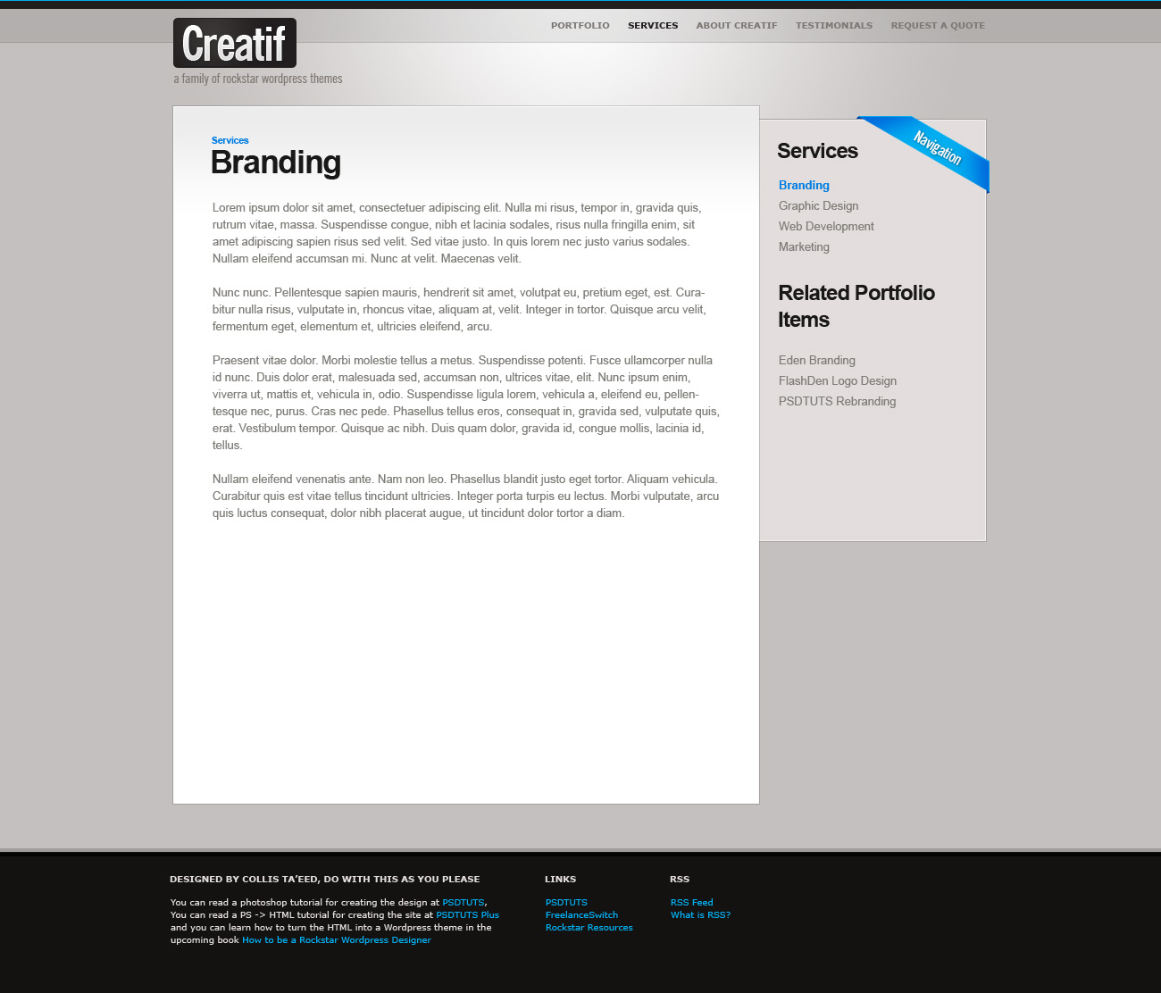
Step 23 - Making the Generic Page
Making our final page is a piece of cake now. We just duplicate our blog.html and call it page.html this time. Then remove the featured blog post and alter the HTML of the #block_content area as follows:
1 |
<div id="block_content"> |
2 |
|
3 |
<div id="content_area" class="block"> |
4 |
<div class="block_inside"> |
5 |
|
6 |
<h4>Services</h4> |
7 |
<h2>Branding</h2> |
8 |
<br /> |
9 |
<p>Lorem ipsum dolor sit amet, consectetuer adipiscing elit. Nulla mi risus, tempor in, gravida quis, rutrum vitae, massa. Suspendisse congue, nibh et lacinia sodales. </p> |
10 |
<p>Risus nulla fringilla enim, sit amet adipiscing sapien risus sed velit. Sed vitae justo. In quis lorem nec justo varius sodales. Nullam eleifend accumsan mi. Nunc at velit. Maecenas velit. <a href="#">Read More</a></p> |
11 |
|
12 |
|
13 |
</div>
|
14 |
</div>
|
15 |
<div id="sidebar"> |
16 |
<img src="images/ribbon_navigation.png" class="ribbon" alt="Featured Project"/> |
17 |
<div class="block_inside"> |
18 |
|
19 |
<h3>Services</h3> |
20 |
|
21 |
<ul>
|
22 |
<li><a href="">Branding</a></li> |
23 |
<li><a href="">Graphic Design</a></li> |
24 |
<li><a href="">Web Development</a></li> |
25 |
<li><a href="">Marketing</a></li> |
26 |
</ul>
|
27 |
|
28 |
<h3>Related Portfolio Items</h3> |
29 |
|
30 |
<ul>
|
31 |
<li><a href="">Eden Branding</a></li> |
32 |
<li><a href="">FlashDen Logo Design</a></li> |
33 |
<li><a href="">PSDTUTS Website</a></li> |
34 |
</ul>
|
35 |
|
36 |
</div>
|
37 |
</div>
|
38 |
|
39 |
<!-- a Clearing DIV to clear the DIV's because overflow:auto doesn't work here -->
|
40 |
<div style="clear:both"></div> |
41 |
|
42 |
</div>
|
Which is pretty much the same HTML as previously just with some different text and a new ribbon. The only real change is that now we have a title and above that a subtitle wrapped in an <h4> tag. So we can style that with a couple of lines of CSS as follows:
1 |
h4 { |
2 |
color:#007de2; |
3 |
margin:0px 0px 0px 0px; |
4 |
}
|
And that is that! See the final generic page here.


Step 24 - It don't matter if it's Black or White!
Now we're going to do some very simple CSS to switch the site from light to dark. What's neat about this is the only HTML we need to alter is this one line:
1 |
<body id="dark"> |
That's it! With that one bit of extra HTML code we can make all the CSS adjustments necessary. This means if you wished you could very easily make a little Javascript button that switches the stylesheet. The way it's going to work is for any class which needs to change we just add an extra style beginning with body#dark. So first of all we say:
1 |
body#dark {
|
2 |
background-color:#1e1d1b; |
3 |
} |
4 |
body#dark #main {
|
5 |
background:#292826 url(images/background_dark_slice.jpg) repeat-x; |
6 |
} |
7 |
body#dark #main .container {
|
8 |
background-image:url(images/background_dark.jpg); |
9 |
} |
10 |
body#dark #footer {
|
11 |
background-image:url(images/background_dark_footer.jpg); |
12 |
} |
13 |
body#dark ul#menu li a.active, ul#menu li a:hover {
|
14 |
color:#ffffff; |
15 |
} |
And that tells the browser that if <body id="dark"> then to override the styles for #main, #main .container, #footer, and the active and hover states of the menu, swapping in some new background images and changing the text colour to white! Easy as pie!


Step 25 - Borders and Fixing the Text
As you can see in the image below our footer is fixed thanks to the new background image and colour, there's just two more fixes: the "Creatif is a WordPress ..." text and the borders around the boxes which are quite light and should be dark now. So we do this:
1 |
body#dark .block, body#dark .mini_portfolio_item { |
2 |
border-color:#1b1a19; |
3 |
}
|
4 |
body#dark #text_column h2#text_title { |
5 |
background-image:url(images/creatif_dark.jpg); |
6 |
}
|


Step 26 - Alternate Colour!
And that's it! We have an alternate colour scheme all controlled by a single id tag on the <body> element. That's the magic of transparent PNG files and CSS for ya!


Finito!
So that's it! The HTML is totally finished. Don't forget you can see the full pages by following these links:
Additionally you can download the full HTML/CSS/Image source files here and via PSDTUTS Plus you can get the full layered PSD files *and* a tutorial on designing them up.
Extra Resources
If you’re new to converting PSD to HTML, we’d recommend a number of introductory courses to get you up to speed with the basics:
- PSD to HTML: The Responsive Portfolio Build - by Craig Campbell
- PSD to HTML for Designers by Adi Purdila
If you're looking for a quick solution, there's a great collection of website templates over at Envato Market. Starting from just a few dollars, it's a great way to quickly get started with your project, using a design that looks modern, professional, and awesome!


