I’ve been thinking about interior paint colors in my new house (which I know I haven’t shown you yet, its coming).
Let me begin by saying I love gray. Its popularity grew throughout 2009 and 2010, its an amazing neutral that can be moody, crisp, modern or sophisticated.
Gray is what I’ve chosen for the wall color in the master bedroom in the new house. Currently in the running (all Ben Moore colors),


Then purple began finding its way in to my thoughts as I was laying in bed staring at the walls, imagining them light gray. I like those deep shades of purple that seem to change throughout the day, those dark and earthy eggplant/brown/sometimes black hues. If asked I would tell you that out of all of the colors I like purple least of all. As a side note, purple is one of Betsy’s favorite colors, she painted her office purple-see that here. We have always disagreed when it comes to purple.
But…
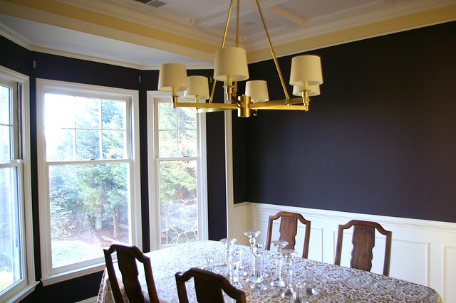
Here’s a little recent purple that I liked-Bryn’s dining room . It turned out pretty great. It’s Martha Stewart’s Kalamata Olive.
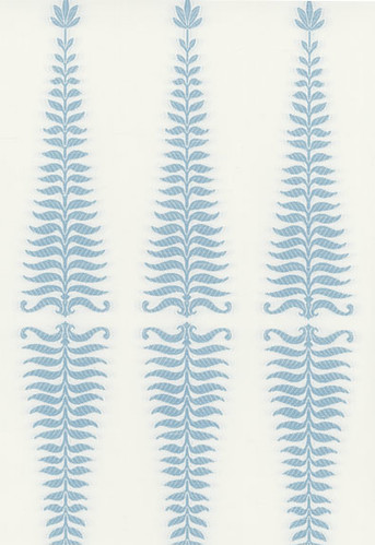
I’m also really in love with Kelly Wearstler for Schumacher’s Fern Tree print and I was thinking about incorporating this in some pillows on the window seat.
and then I read Sarah Cole’s (from Farrow & Ball) color prediction for 2011 in the recent issue of Lonny,
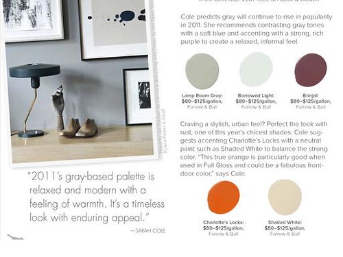
I think that color combo might be a winner; light gray, soft blue and eggplant.Light gray for the wall color accent light blue and deep purple with fabric, accessories and bedding. The combo uses the faithful neutral gray, my favorite color watery blue/aqua and then I’m branching out a bit with the purple.
Speaking of paint–did you know that you can now buy paint from Benjamin Moore online and they will ship it to you?


We used Benjamin Moore’s Silver Fox in our son’s nursery and our bedroom and a lighter color called Abalone in the rest of the apartment. They’ve both got hints of brown in them which makes them go really well with the orange chairs and artwork we’ve got all over the house. (Same bright orange like the Farrow & Ball example above). The only thing you have to look out for is how much light you’ve got in each room – the light colors in bright light seem lighter, and the dark colors in less light definitely feel darker.
You can see the pictures on my blog or here on Ohdeedoh.
http://www.ohdeedoh.com/ohdeedoh/nursery-tours/nursery-tour-baby-daleys-roomtobe-093282
I like these colors together very much. I might remember that orange too for a little surprise moment in some accessories, if it were me!!
If one thing has become a little bit of a signature Sarah style though, its a light crispness in your color selections. The grey will certainly be in line. Though, I think it would be really insane and awesome to see an eggplant wall fit into your signature!
Love ya.
Betsy
Cheap Investors Houses! http://renewreality.com.