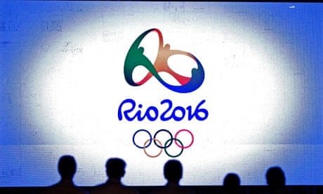
At midnight on New Year's Eve, Rio unveiled its logo for the 2016 Olympics in front of 2 million revellers on Copacabana beach. And I was there. Well, I was on Copacabana beach. To be honest I had no idea that there was a logo ceremony taking place – it was too crowded and I was having too good a time. And even if I'd known about the launch, I wouldn't have bothered threading my way towards the stage. For an Olympic logo? Frankly, for design inspiration I'd have been better off contemplating my flip-flops.
Surely it shouldn't be like this. The launch of a global mark ought to incite a smidgen of anticipation, not just a world-weary roll of the eyeballs. In practice, the bathos, the controversy ("it looks like such and such") followed by the recriminations and possible national embarrassment, are all too predictable. The reason why no one takes Olympic logos seriously as design is because the standard, with precious few exceptions, has been so low. But before we look at why that is, let's give Rio 2016 a fair appraisal.
The first thing to say about the logo, designed by Brazilian design firm Tátil, is that it has spadefuls of that most important quality in any Olympic branding: inoffensiveness. With its ring of multi-coloured figures hand in hand – reminiscent of Matisse's painting The Dance, as others have pointed out – its most obvious message is "togetherness in diversity". On top of that, this being Rio, it also communicates joie de vivre. Already that's a handful, but the designers didn't stop there. The green, yellow and blue colour scheme mimics the Brazilian flag. And if you look at the shape of the logo you'll see that it evokes Rio's most famous natural landmark, the Pão d'Açúcar, or Sugarloaf Mountain. What we have here is a semiotic Where's Wally?
In fairness, the shape of the logo has a three-dimensional, MC Escher-ish cleverness. But it's cheapened by the way the colours fade into each other, and by the brushstroke-effect script beneath it. What is it with this mandatory brushstroke effect? It all began with Josep Maria Trias's bold, and appropriate, use of it for the 1992 Barcelona Olympics but it's been hanging around like a bad smell ever since: in Athens, in Beijing and, most embarrassingly, in Sydney. Sydney's logo, with its boomerangs and Opera House, looked like it was designed by a nursery school class. It is somehow in the nature of Olympic logos to be condescending. They don't credit people with the maturity or the intelligence to find meaning in something dignified and abstract. Their stock in trade is the literal and the faux-naif.
Does the Rio logo need to try and do so much? Does it signify multiple meanings or is it simply inscribed with indecision? I asked one of its designers, Fred Gelli, to tell me the one essential quality that it communicates and he replied "passion and transformation" (alright, I admit, it was a tough question). But there is a clear reason why these designs always come out so wishy-washy, and that's because the brief is near impossible to fulfil. Gelli, whose design emerged from a competition between 139 Brazilian practices, says: "We were asked to transmit Olympic values and attributes, to reflect the local culture, to project the city and country's image, to assure universal understanding as well as be current until the actual Games, along with many other considerations." Is that all? I'm surprised they weren't also asked to make it reveal the word Beelzebub in moonlight.
It's very simple: good design requires a good client. The problem is that municipal Olympic committees tend to be risk-averse, micro-managing and aesthetically stunted, with a far lower sense of where the lowest common denominator is than does the public justice. It follows, therefore, that as the awareness of branding's importance has grown in the politicians' estimation, so the quality of Olympic logos has declined.
The canonical piece of Olympic branding was created by Otl Aicher for the 1972 Munich Games. Aicher's logo was bold and abstract, and did not sink to an easily digestible representation of German national identity. There was no red, yellow and black colour scheme. Why should there be? The Games are not about a single nation. But much more important and memorable than the logo was Aicher's system of pictograms depicting the different sports. These were hugely influential, not just in subsequent Games but in sports centres all over the world. This is a case of how an Olympics can be a catalyst for meaningful design. It may be the only case.
Even better than Aicher's logo, in my opinion, was Lance Wyman's identity for the Mexico City Games in 1968: a bold and unapologetic op-art-inspired graphic. And it is in that striking vein that the good Olympic identities have followed. I think of Ivan Chermayeff's logo for the Los Angeles Olympics in 1984, and in the same year, the red snowflake for Sarajevo's winter Games.
Is it a coincidence that the best Olympic logos have often denoted Games that are remembered more for political incident than sport? The enduring image of the Mexico City Games in 1968 is of the African-American sprinters Tommie Smith and John Carlos raising gloved fists in a Black Power salute. Munich, of course, was marred by the murder of 11 Israeli athletes by terrorists, and part of the Sarajevo Olympic stadium had to be turned into a cemetery. Perhaps these events make the logos seem more historic than they would otherwise – but you could equally argue that the logos are strong enough to support those memories in a way that the more insipid recent designs are not.

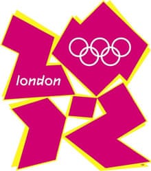
Compared to the politically correct designs of Sydney and Rio et al, the London 2012 logo has a certain edgy panache. At least it has the balls to be brash. But having blamed clients earlier, one has to admit that sometimes the designer just gets it wrong, and London's mark is one of those cases. Yes, it evokes London in its punky choppiness and nu-rave fluoresence, but in an inauthentic, embarrassingly try-hard way. This is a problem with big branding agencies such as Wolff Olins, authors of the 2012 logo: they are often as susceptible to design by committee as the Olympic committees themselves.
The Aicher and Wyman days are over. No longer are art directors with a singular vision given the responsibility they need to create something unique and memorable. There are too many boxes to tick now; the whole process has been health-and-safetied. Politicians believe that the branding is too important to leave to designers. They really ought to loosen up – you never know, they might get themselves a decent logo.
