Designing in the Dark: 10 Dark Sites and Their Color Schemes
What goes well with a black website? Today we’ll find out but taking a look at some excellent examples of dark web design along with their primary color palettes.
Each website will have a screenshot along with a brief description, a visual representation of the color scheme, and a link to download the Photoshop color swatches from Pictaculous.
The Ultimate Designer Toolkit: 2 Million+ Assets
Envato Elements gives you unlimited access to 2 million+ pro design resources, themes, templates, photos, graphics and more. Everything you'll ever need in your design resource toolkit.


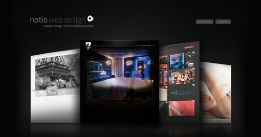
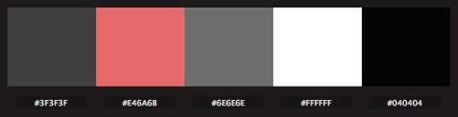
Notio Web Design
Here the page itself has very little color and serves as more of a black matte to show off the designer’s work. This makes for a really classy feel, especially when combined with the subtle glow and reflections.
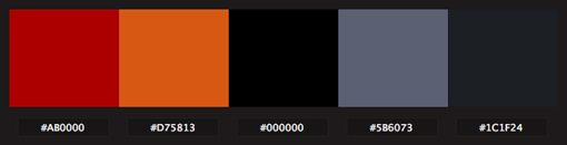
Sofasurfer is now Digitallabs
When designing with a dark theme, it can often be quite powerful to mix in a single bold color (primarily) and use it repeatedly as the designer did with orange below.

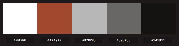
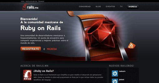
Rails.mx
The Rails site below definitely makes some bold color choices. This is mostly thanks to the excellent Ruby icon design, but the supporting colors work extremely well.
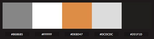
Dubbed Creative
As with SofaSurfer, here we see a mostly grayscale color palette with bursts of color to draw your attention to key points. This is a major function of color in web design. Always consider how you can structure the experience and guide the user through words, graphics, and of course, color.

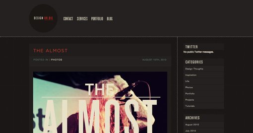
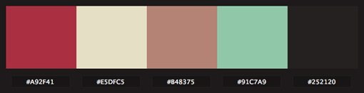
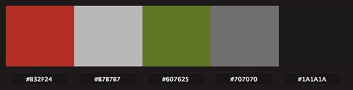
Design or Die
This one is probably my favorite color palette in the whole list. The muted colors work very well together and create a decidedly retro feel. Time periods can definitely be communicated strongly through your color choices. Keep in mind this happens whether you intend it to or not!
Rodeopark Communication
Similar to the first site, this one draws most of its color from the samples of work in the thumbnails.

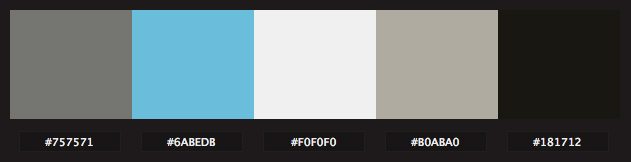
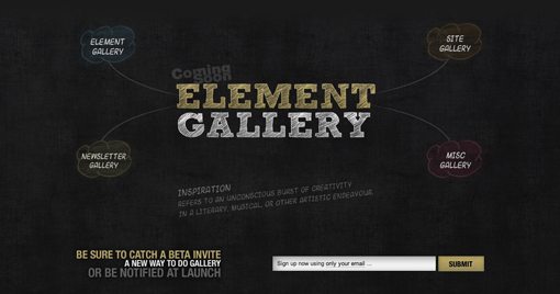
Element Gallery
The colors here stand out perfectly from the grungy chalkboard background. Notice the variation of color is repeated throughout both the graphical elements and the typography.
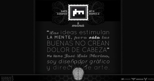
Jose Luis Merino Parra
This one shows that you don’t always need color to have a great design. Sticking with a pure grayscale color palette can make a strong statement.

Osvaldas Valutis
I love the concept there. A burst of color and life is breaking through the cracks of a colorless world. Very well done!

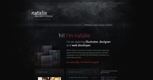
Natalie Sklobovskaya
Natalie uses a mixture of some really rich textures, graphics and colors to create a spooky environment that looks absolutely beautiful.
Show Us Yours!
Now that you’ve seen the color schemes from some of our dark sites, leave a comment below with a link to your dark site. Be sure to tell us about your color scheme and what you were trying to convey with it.