Do typefaces really matter?
- Published
To most people, typefaces are pretty insignificant. Yet to their devotees, they are the most important feature of text, giving subliminal messages that can either entice or revolt readers, says Tom de Castella.
When Avatar, the biggest grossing movie of all time was released, one section of the audience was immediately outraged.
Graphic designers hated it. Why? They didn't like the font that director James Cameron had chosen for the subtitles.
"I hated it on the posters and then threw up a little in my mouth when I realised I would have to read that ugly font throughout the film in the subtitles," one blogger commented.
"After the hundreds of millions of dollars spent on CG effects, did he just run out of money for a decent graphic designer?"
And yet fonts are not just for geeks. Otherwise why would organisations around the world spend so much time and money changing their typeface?
A new look
In April, the Mail on Sunday reported that the Foreign and Commonwealth Office spent £80,000 changing its typeface to one that was almost identical.
Last month Gatwick Airport unveiled a new logo, replacing a rather austere style with a custom-made, handwritten script. A spokeswoman said the change was an attempt to emphasise the airport's "personal touch". And in the past week the BBC website has taken on a new look, replacing Verdana font with Arial (on PCs) and Neue Helvetica (on Macs).
But can different shaped letterforms really convey those values?


The power of the font goes back to the Greeks, says Julie Strawson, director of Monotype Imaging, an international type-design company. "The Greeks created handwriting and that's one of the most personal ways of communicating."
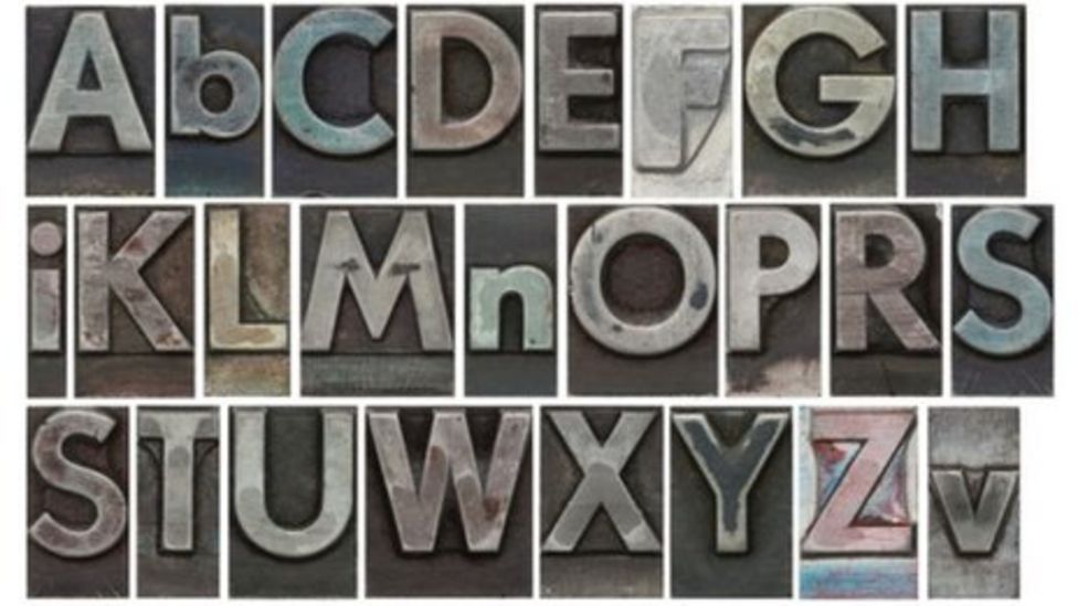
A typeface may never quite be able to replicate the intimacy of pen and ink but with an estimated 200,000 fonts to choose from today, there are no shortage of different styles to choose from.
Selecting a font is like getting dressed, Ms Strawson says. Just as one chooses an outfit according to the occasion, one decides on a font according to the kind of message you are seeking to convey.
One of the crucial dilemmas is whether to opt for serif or sans serif. In a serif typeface the letters have extra curls and bobbles, reminiscent of calligraphy, whereas in sans serif (literally without serif) the letter forms have clean lines without any protruding bits.
"Some people find serif best because, like handwriting, it helps the eye to link the letters," Ms Strawson says. "With sans each character is completely separate, there's more white space which is why some find it more readable."
The typeface matters because of its power to create a sense of recognition and trust, she argues: "Everyone recognises the BBC just from three characters in Gill Sans. It's an icon. If you wrote BBC in a flowery font people wouldn't recognise it."
Banks are particularly aware of this, with companies like Barclays creating their own branded font to reinforce a sense of security at a time when fear of fraud and scamming is high.
But Jonathan Barnbrook, founder of the website Virus Fonts, believes the power of typography goes beyond such utilitarian aims.
"A good typeface creates an emotional response in relation to the message it is conveying. You're trying to get that tone of voice right - you can shout or whisper. And you want to sum up the spirit of the age, because they do date quite quickly."
People have become more aware about the impact of fonts because of computers, but the power of a typeface is still largely subliminal, he argues. Mr Barnbrook is best known for producing provocatively named, subversive fonts such as Exocet, Bastard, Prozac and Nixon. He also designed the cover of Heathen, David Bowie's 2002 album.
"I talked a lot with Bowie - the discussions went back and forth. He's the creator and you're trying to get the atmosphere of the music across in the design. I chose one of our own fonts - Priori - which is formal but playful, as the album was quite dark."
Indeed there's no limit to the emotional range a typeface can reflect. "Typography is so closely associated with language so you can express irony and get the whole complexity of emotion in there," adds Mr Barnbrook.
It's part of a typeface designer's essential make-up to get hung up on tiny details. And sometimes that can be downright annoying, he admits: "The problem is you're watching a film and you notice a sign. You realise that the letterforms are 20 years later than the era the film is supposed to be set in."
Indeed for some, fonts take on almost life and death significance. The Swiss font Helvetica has a cult following celebrated by the 2007 documentary of the same name.
Helvetica = cheap
But for Bruno Maag, managing creative director of typeface studio Dalton Maag, Helvetica is a cultural blight.
"If you think of ice cream, it (Helvetica) is a cheap, nasty, supermarket brand made of water, substitutes and vegetable fats. The texture is wrong and it leaves a little bit of a funny aftertaste."
Rather than being the modernist font supporters say it is, he argues that Helvetica is based on "antique" designs and made up of badly executed letter forms, although he admits these are "tiny details" most people will never spot.
"Lower case Ss are notoriously difficult to get right. But in Helvetica it's not straight - you want to go in there and tighten it up. And the 'a' looks so woolly and ill-conceived, it really winds me up."
As much as he hates Helvetica, he loves Univers, another Swiss-invented design. "It's the true modernist typeface. There's no fuss and schmuss about it, it's a clean, tight design. If Helvetica is Julia Roberts - pretty enough - then Univers is Uma Thurman - really cool."
But the Canadian blogger Mike Battista, who blogs at phronk.com, has had enough of the font police. He was first alerted to the problem when the graphic design community reacted angrily to the use of Papyrus for the subtitles in Avatar.
"I follow a lot of the graphic design community on Twitter and there were so many people querying Papyrus. They jumped on it because they think it's too flashy and gimmicky. But subtitle fonts don't matter as long as you can read them."
Mr Battista concludes that the font has been elevated to an absurdly high cultural status by a small, self-indulgent elite.
"These people remind me of wine snobs - they can detect all these subtle notes and flavours but the average person probably won't notice all these tiny flourishes on a font. When you're reading an article you're not thinking about the font. You have to be looking at fonts all day before you start getting emotional about them."
An obsession with typefaces may even be reducing our productivity, he warns.
"The other day I heard that people are getting 'font paralysis'. They couldn't move forward with their work because they were unable to decide on which font to use."