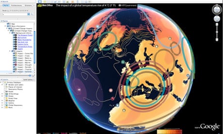
Think it's hot this summer? Wait until you see Google's simulation of a world with an average global temperature rise of 4C.
Using a map that was first launched by the former Labour administration in October 2009, the coalition government has taken temperature data from the Met Office Hadley Centre and other climate research centres and imposed it on to a Google Earth layer.
It's a timely arrival, with warnings this month that current international carbon pledges will lead to a rise of nearly 4C and the Muir Russell report censuring some climate scientists for not being more open with their data (but exonerating them of manipulating the scientific evidence).
Unlike a similar tool using IPCC data that was launched by Google in the run-up to the Copenhagen climate conference last year, this map will be updated regularly with new data. It also has a series of YouTube videos of experts across the globe, with Met Office staff talking about forest fires in sub-Saharan Africa and researchers at the Tyndall Centre for Climate Change Research explaining sea level rises. To go more in-depth you can follow links to government sites, such as this one on water availability in a warming world.
Playing with the layer is surprisingly addictive, mainly thanks to Google Earth's draggable interface. Unlike the static map of last year, it also has the bonus of showing more obviously how temperature rises will differ drastically around the world. The poles glow a red (a potential rise of around 10C) while most of northern Europe escapes with light orange 2-3C rises. Other hotspots, such as Alaska, the Amazon and central Asia, also stand out.
Neatly, you can turn different climate "impacts" on and off. If you just want to see which regions will be worst affected by sea level rises - such as the UK and Netherlands as well as low-lying island states - you can. One limitation is that you have to zoom out to continental level to see the layer: if you're zoomed on your street, you can't see it.
Climate change minister Greg Barker launched the map today alongside the government's chief scientist, Prof John Beddington. Barker said: "This map reinforces our determination to act against dangerous man-made climate change. We know the stakes are high and that's why we want to help secure an ambitious global climate change deal."
The layer, of course, isn't the only one with an environmental theme to land on Google Earth. The UN's environment programme has one showing deforestation, WWF has a layer highlighting its projects across the globe and Google even has its own climate change "tours" for Google Earth. What other good green Earth layers have you stumbled across? And how do you rate the newest addition from the UK government?

Comments (…)
Sign in or create your Guardian account to join the discussion