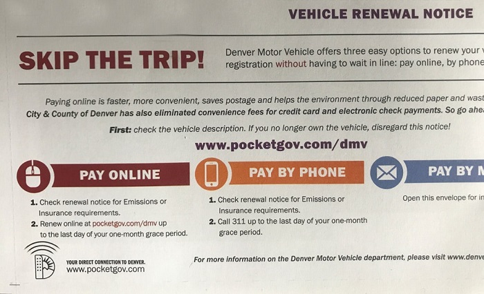
 Do you like standing in line at the DMV?
How do you register a new business?
Who is your state representative in Congress?
Over the last decade, many US states have begun to digitize a lot of their services.
This results (hopefully) in less standing in line, less time waiting on hold, and fewer people needed by the state to answer basic questions. It’s not only better for residents, but also the budgets of state governments. For example, calls to government centers can cost $3-$5 per call.
But simply having a website doesn’t solve all the problems. People need to know about the services (awareness), find the information on often bloated portals, and then complete tasks (which can mean navigating antiquated web pages and forms).
While state governments have come a long way in providing services online, the quality of the online experience falls far behind the typical online retail experience many of us have become used to.
To understand the online experience of state government websites, we benchmarked the desktop user experience of five state government websites:
- California (CA.gov)
- Colorado (Colorado.gov)
- Florida (MyFlorida.com)
- Illinois (Illinois.gov)
- New York (NY.gov)
We collected SUPR-Q data, including NPS data, as well as investigated reasons for using, website attitudes, understanding of key features, and impact on users’ ability to complete tasks on each of the websites. Full details are available in a downloadable report.
Study Details
We recruited 437 participants in February 2018 for a perception and usability study to test the state government sites. For the perception study, we asked 288 residents of one of the five respective U.S. states to reflect on their most recent experience on the government site for their state. Participants in the studies answered the 8-item SUPR-Q (including the Net Promoter Score) and questions about their prior experience. In particular, we were interested in current users’ attitudes toward the site, whether they felt the information was complete, and whether they found the services on the website (e.g. renew registration) easy to use.
For the usability portion, we asked 149 participants to complete a vehicle registration task on one of four state government websites or voter information for Florida. Note: Florida required participants to enter personal information before even seeing the vehicle registration page so we needed another task.
- Vehicle registration: Imagine that you’re living in [California, Colorado, Illinois, New York] and you need to renew your vehicle registration. On the following website, try to find the webpage for the online service to renew your vehicle registration.
- MyFlorida.com variation: Imagine that you have recently moved to Florida and you need to register to vote, and you want to be sure to do so before the next election. On the following website, try to find the deadline by which you must register to vote in the state of Florida.
Participants also answered the 8-item SUPR-Q (including the Net Promoter Score) and questions about their experience completing the tasks on the website.
Quality of the State Gov’t Website User Experience: SUPR-Q
The SUPR-Q is a standardized measure of the quality of a website’s user experience and is a good way to gauge users’ attitudes. It’s based on a rolling database of around 150 websites across dozens of industries. Scores are percentile ranks and tell you how a website experience ranks relative to the other websites. The SUPR-Q provides an overall score as well as detailed scores for subdimensions of trust, usability, appearance, and loyalty.
For the perception study, the scores for the five state government websites range from a bit below average to slightly above average. The average SUPR-Q is at the 45th percentile (scoring better than 45% of the websites in the database). MyFlorida.com has the lowest SUPR-Q of the group at the 31st percentile. CA.gov leads the group with scores at the 57th percentile.
In the usability study, CA.gov also has the highest overall SUPR-Q score of the group (at the 81st percentile) compared to MyFlorida.com that has the lowest at the 20th percentile. We conducted a similar analysis in 2012 on CA.gov, Colorado.gov, Illinois.gov, and NY.gov. The results showed that all sites had statistically higher SUPR-Q scores in 2018 compared to our usability data in 2012. The average SUPR-Q score for this group rose from 3% to 54%.
Usability Scores
For the usability of the state government sites, CA.gov also has the highest score of the group (at the 54th percentile in the perception study and at the 81st percentile in the usability study). Compared to MyFlorida.com, which has the lowest usability scores for both the perception and usability studies (33% and 24% respectively).
Loyalty/Net Promoter Scores
This year, state government websites have an average NPS at about –18% in the perception study and –13% in the usability study. Probably not surprisingly, users of government sites aren’t too excited to recommend the experience to their friends. It could be because people had a poor experience on the website or quite simply because they don’t feel they need to recommend a government website (or both). Interestingly though, these scores are similar to social media website scores.
Although there are still more detractors than promoters, the scores are up substantially from 2012. The average NPS has increased from –72% in 2012 to –7% in 2018.
Why People Use State Government Sites
To make the most of their budgets, state governments should understand what its citizens are trying to accomplish online. As part of this benchmark, we asked participants what they attempted to do on their last visit and also how often they visited in the last year.
Half the respondents reported visiting their respective state government websites a few times per year, while about 25% of those from California and Illinois visit their state government website as often as a few times per month.
We found people were usually either using a service or were looking up information to answer a question. For example, “renewing a license or registration” and “looking up information” were the top reasons to come to the state government websites.
More specifically, we found that 15% of users who were seeking information on the sites were trying to find out more about their state and local representatives:
- “I was trying to figure out who my local assemblyman was. It wasn’t directly on the site, but there was a link on the New York state site that took me to a different site where I was able to get the information.”—NY.gov user
- “I was looking up information on state representatives and congressional districts.”—CA.gov user
- “I was trying to find out more information on Bruce Rauner. I wanted to see what he’s done while he’s been in office so far.”—Illinois.gov
Other participants reported looking up information for a school project (6%), local counties (6%), jury duty (6%), and housing codes (6%).
Trouble Finding Information
The top reason participants mentioned disliking the California, Colorado, and Illinois websites is that it was difficult to find the correct information:
- “There’s so much information that you have to drill down many ‘layers’ to get specific information.”—CA.gov user
- “I can’t find the forms I need, I can’t be sure I’m getting complete information”—Colorado.gov user
- “It could get confusing searching for certain items.”—Illinois.gov user
On the Illinois.gov website, only about half of respondents agreed with the statement “The information on this website is complete.” A good use of resources for these government sites is to ask participants to rank the most important information they are looking for (using a site intercept or survey). These websites have a lot of information and comments about poor findability are usually a symptom of poorly prioritized information.
Poor Website Organization
Unclear organization of the sites contributed to task failure in the usability study. Specifically, we found that participants did not know where to start looking for the information. The most common usability issue we found across the websites was lack of a clear call to action (CTA) on the home page.
- “There is just so much information on the site … it can be intimidating to try and find whatever information you’re looking for. For instance, if I click on one of the categories in the top (header) row I’m taken to pages and pages of information …”—CA.gov user
- “I initially went to the wrong webpage because I expected to find online registration with the other registration information.”—Colorado.gov user
- “I wasn’t sure where to go at first…”—Colorado.gov user
On 3/5 websites, the word “services” was used in the category label where participants needed to go to renew their vehicle registration (e.g. “Getting Services”, “Online Services,” and “Services”). “Services” was not a clear enough keyword for participants who were looking to renew their vehicle registration.
- “Finding the vehicle registration renewal was difficult. I had to know to look in services and transportation.”—NY.gov
Participants were looking for keywords like “Driver” or “Driving.” For example, on Colorado.gov most participants (4/5) expected to renew their vehicle registration by clicking Driver Services, which is actually incorrect! The correct path to renew a vehicle registration is starting with Online Services, which was misleading (as shown in Video 1).
Video 1: A participant having trouble finding vehicle registration on Colorado.gov.
CA.gov was the leader of the group with the best SUPR-Q scores across all the state government sites. Compared to the other sites, the process of finding the page to renew a vehicle registration was much more streamlined on CA.gov. It might be because there are so many drivers in California!
If users got started out on the correct path, it was easy to renew a vehicle registration. Furthermore, the search feature on CA.gov was very easy to use and returned helpful results to users, unlike Illinois.gov and NY.gov where participants suffered from irrelevant search results.
However, the CA.gov experience was not without issues; some users who tried to browse on CA.gov did have trouble finding vehicle registration. Getting Services was not an obvious starting point. We saw some users scrolling around on the home page (as shown in MUIQ Video 2 ).
Video 2: A participant having trouble on the CA.gov website.
MyFlorida.com had the worst SUPR-Q scores in the group and it was easy to see why from the poor and outdated design of the site. At the time of the study, the website had no top navigation and very little categorization of topics on the website. It simply showed a list of links to choose from, in seemingly no particular order. Since this study, the MyFlorida.com website has undergone a redesign (yay Florida!)
Video 3: Florida.com’s outdated navigation made it difficult to find basic services.
Summary
An analysis of the user experience of five U.S. state government websites found:
- Experience is below average: The SUPR-Q scores for this group of websites are at the 45th percentile, with the Florida website needing the most improvement and California’s the best at the 57th.
- Major improvements since 2012: The below average SUPR-Q scores in 2018 are a major improvement from when we collected usability data in 2012, where the websites generally scored worse than 90% of the websites in the SUPR-Q database.
- Overwhelming amount of info on the sites: State government websites have a wide variety of topics and services that get overwhelming and are poorly organized. A top-task analysis would help state governments prioritize the content from their citizens’ (not government bureaucrats’) viewpoint.
- Renewing vehicle registration & finding government info dominate: The top reasons people report visiting state government websites is to renew a license/registration and to find information about government officials.

")
")