
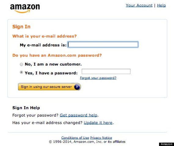
Amazon may be at the cutting edge of the tech world, but for a long time its dedication to innovation has had one glaring exception: its login page, which looks almost Craigslist-like in its hideousness.
But apparently, that's changing now. After an uncomfortably long stint, some users are reporting that Amazon is finally bringing its login page into the 21st century, Fast Company reports. The login page was its usual ancient self when The Huffington Post checked it prior to publication, but according to a tweet by Luke Wroblewski, an entrepreneur and web product designer, a sleeker login is on its way:
If the image in that tweet is hard to see, here is the old page:
And here is the new one:
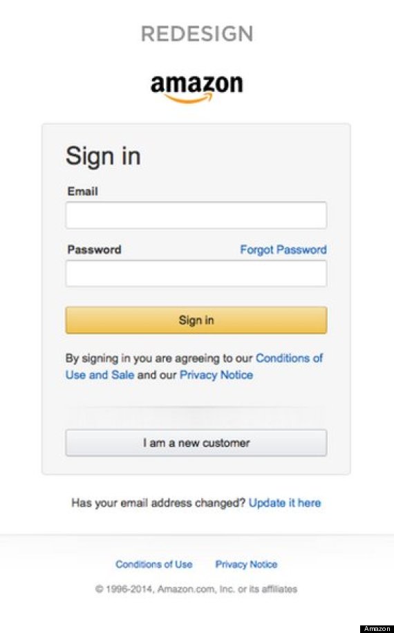
As you can tell, the page is now significantly less cluttered. The switch is likely part of a wider site revamp to make it more tablet- and mobile-friendly. And indeed, the thinner design and larger buttons will make it easier for people to use on smartphones, as Gizmodo points out.
Fast Company also notes that the new login reflects a more tech literate audience than the neophytes the original page was designed to usher in. Gone is the now-quirky sounding "My email password is," as well as the clear reminder that its servers are secure. In its place are the more simple prompts we're used to seeing today.